Welcome back to my UWP Community Toolkit series. The previous five tips in the series can be found here:
- Part 7, the Sample App
- Part 8, 2 Developer Tools
- Part 9, DockPanel Control
- Part 10, OrbitView Control
- Part 11, PullToRefreshListView Control
Intro
The UWP Community Toolkit has a few controls to add headers to your WPF application's content. Drop this into your app and add a little styling to match their look to the rest of your app and you'll quickly and easily save time creating repetitive markup throughout your UI.
The HeaderedContentControl
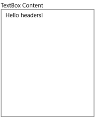
The HeaderedContentControl provides the base functionality for the other headered controls. It will display a header along with any content. Wrap any of your existing controls with this one to quickly add some header text. Here's an example of the HeaderedContentControl containing a TextBox.
<HeaderedContentControl Header="TextBox Content"
                                     HorizontalContentAlignment="Stretch"
                                     VerticalContentAlignment="Stretch"
                                     Margin="4">
     <TextBox Text="Hello headers!"/>

</HeaderedContentControl>
That markup will render the following UI in your WPF Window:
Pretty simple. As you'll see in the next section, it is also pretty simple to add some style to the header text too.
The HeaderedItemsControl
The HeaderedItemsControl providers all of the functionality of a standard ItemsControl with a header added above the items. It's a HeaderedContentControl but the content is always an ItemsControl. Set the Header text property and the ItemsSource to your list of items, and you're all set. You can drop this in place of any of your existing ItemsControls and re-use the same ItemTemplate to achieve an identical look and feel of the list items.
With any of the headered controls, the header itself can also be customized be assigning a DataTemplate to the HeaderTemplate, in this case the HeaderedItemsControl.HeaderTemplate.
Here's the simplest use of the control, with the Header hard-coded and the ItemsSource bound to a collection in the DataContext.
<controls:HeaderedItemsControl Header="Some Items"
                                 ItemsSource="{Binding SomeItems}" >
Take a look at a couple of HeaderedItemsControls in the UWP Community Toolkit Sample App. The first list's XAML is as simple as mine above. The second add a little custom layout to the header and the list.
Here's the markup to add the blue foreground to the second header.
<HeaderedItemsControl.HeaderTemplate>
     <DataTemplate>
         <TextBlock DataContext="{Binding DataContext, ElementName=Page, Mode=OneWay}"
                    FontSize="16"
                    Foreground="Blue"
                    Text="Header 2" />
     </DataTemplate>

</HeaderedItemsControl.HeaderTemplate>
The HeaderedTextBlock
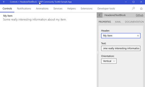
The HeaderedTextBlock control providers a quick way to display some read-only text with some corresponding header text. It's a HeaderedContentControl but the content is always a TextBlock. The three properties you need to know are straightforward: Header, Text and Orientation. You can lay out the header and text in a Horizontal or Vertical layout, the Vertical being the most common use.
Check it out in the Sample App.
Here's the corresponding XAML for the control.
<controls:HeaderedTextBlock
     Header="My Item"
     Text="Some really interesting information about my item."
     Orientation="Vertical"
     Margin="20,10,0,0" />
A few of these controls is a great, simple way to lay out a read-only form on your app.
Wrap-Up
Go grab the latest toolkit packages via NuGet or browse the repo on GitHub today! There are many more controls you can use in your apps today. We'll check out a few more in a couple of weeks.
Happy coding!


No comments:
Post a Comment
Note: Only a member of this blog may post a comment.