Friday, November 2, 2018

Windows Developer Resource Roundup - November 2018 Edition

I typically leave the link blogging over on the Morning Dew, but I thought my readers here might appreciate a post with a rundown of useful resources for Windows developers.

GitHub Repositories

We'll start off with some GitHub repos that I have starred. The organizations behind each repo are listed in parentheses.

Windows UI Library (Microsoft) - These are the Microsoft UWP XAML controls/styles/materials created for backward compatibility across Windows 10 versions back to the Anniversary Update. As new features are added, you can immediately make them available to your apps across all of these versions of Windows.

Windows Community Toolkit (Windows Community Toolkit) - If you follow my blog, you're very familiar with this toolkit. Formerly known as the UWP Community Toolkit, it now provides a phenomenal set of controls, helpers and services for all Windows developers.

Windows Template Studio (Microsoft) - I've also blogged about this extension on several occasions. WTS provides templates for Visual Studio and a wizard to bootstrap your UWP app with a great foundation built on popular tools and good patterns & practices.

Rapid XAML Toolkit (Microsoft) - This toolkit is a newer community effort spearheaded by Matt Lacey. It is still in preview and aims to accelerate app development for all XAML developers - UWP, WPF, and Xamarin.Forms. I blogged about the toolkit a couple of weeks ago if you would like to learn more.

Fluent XAML Theme Editor (Microsoft) - This is the source code for the Fluent XAML Theme Editor app, now available in the Windows Store. Build your own Fluent theme with light and dark support and use it in your own apps. The app requires Windows SDK version 17763 or higher.

Prism (Prism Library) - Prism is the ultimate framework for XAML developers, with support for WPF, UWP, and Xamarin.Forms. Make your apps more maintainable and testable with simple and robust MVVM, DI, commands and other patterns & tools.

MVVM Light Toolkit (Laurent Bugnion) - MVVM Light offers an alternative to the MVVM framework provided in Prism. It supports UWP, WPF and Xamarin Forms/iOS/Android. This was the first MVVM library I used and it's still a favorite when putting together sample apps.

Documentation

A good framework or toolkit needs great documentation, right? Get the docs here, or contribute to them with your own expertise!

Universal Windows Platform Docs - The Microsoft Docs landing page for all UWP documentation. There are resources to get started, design, develop and publish your apps, as well as a full API reference.

Windows Community Toolkit Docs - The Microsoft Docs home for Windows Community Toolkit docs. Get help with controls or helpers in the toolkit, use get a reference for APIs or contribute to the docs yourself.

Prism Documentation - The official docs for the Prism Library. There are some general guides and sections specific to WPF and Xamarin.Forms.

MVVM Light Documentation - The MVVM Light docs have some samples, walkthroughs, and a link to a fundamentals course on Pluralsight.

Blogs

Keep up with the latest news.

Windows Developer Blog - The official Microsoft blog for the Windows Dev team. Subscribe for updates on SDKs, toolkits, Windows 10 releases and more.

Windows 10 Blog - This blog is the place to get announcements of new Windows features, upcoming events, and releases of new Windows 10 builds (final and Insiders).

The Visual Studio Blog - If you're a Windows developer, there's a pretty good chance you use Visual Studio. Keep up with the latest VS news here.

XAML Brewer - Diederik Krols has some great UWP tutorials on his blog, most recently about improving accessibility in a control.

Official Microsoft Sites

Windows Dev Center - The Microsoft hub for Windows developers. This site has links to all the resources Windows developers need today. Get to docs, tools, SDKs, events, design resources, and register to sell your apps on the Store through the Partner Center dashboard.

Visual Studio App Center - Sign up for the App Center can get continuous integration against your app's repo, test it on actual devices with automation, and deploy to beta testers and production users. You can also get crash reports and analytics with a few API hooks in your app.

Microsoft Design - Get information about the Fluent Design System and start designing and developing your apps with Fluent Design.

Windows Community Toolkit Sample App - Get the sample app to demo the components inside the Windows Community Toolkit.

Visual Studio Marketplace - Windows Template Studio - Download and install WTS from the VS Marketplace. Love the tool? Leave a review!

Other Sites

Prism LIbrary - Prism's home page. It's got links to their docs, learning resources and their Slack channel.

MVVM Light Toolkit - The MVVM Light homepage.

Stack Overflow - Questions tagged "uwp" on Stack Overflow.

@windowsdev - Follow the Windows Developer team on Twitter.

#ifdef WINDOWS - Join Nikola Metulev, Sr. Program Manager for Windows Dev, for a regular video series on Channel 9 where he interviews engineers on the Windows platform.


That's all I have for this first edition. If you have suggestions for future posts, please leave a comment or ping me on Twitter. I plan on posting these semi-annually, but if I get enough suggestions, I may have to create a second edition sooner. Thanks!

Saturday, October 13, 2018

UWP Tips Early Look - Rapid XAML Toolkit (Beta)

Note: The Rapid XAML Toolkit isn't UWP-specific. You can leverage these tools for WPF and Xamarin.Forms development. XAML developers, check it out today!

In today's tip, we will have a peek at a cool project still in early beta stages, the Rapid XAML Toolkit. What is this toolkit? From their readme.md on GitHub:
These tools aim to reduce the time and effort required to get the basics working and allow you to customize the UI to meet your preferences or the specific needs of your app. We can't and don't try to create the whole app for you but we can make creating and working with XAML faster easier.
In short, the toolkit can take a set of properties from a ViewModel in your project and generate XAML controls in your corresponding View.
To give this a try, you will need to download the source and run it in an experimental instance of Visual Studio. Get the full instructions from the getting started guide here. No VSIX file is available yet to run the toolkit in VS itself. That will be coming later. Let's give it a try.
You should have completed these steps from the getting started guide:
  1. Clone or download the Rapid XAML Toolkit solution
  2. Open and build the solution
  3. Run/Debug the toolkit solution in an experimental VS instance
Now, in the newly started instance of Visual Studio, create a new UWP project.

rapid01

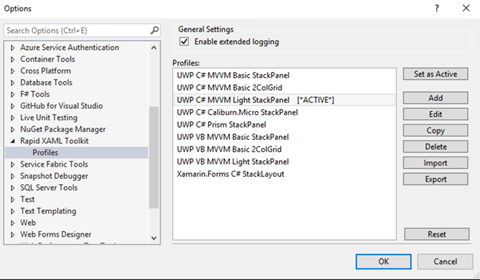
You could also open an existing UWP project, if you have one handy. If not, add a new ViewModel, some model classes, and set up your data context, using your favorite MVVM toolkit/method. One other thing you will need to set up is in the Rapid XAML Toolkit settings in your VS options:

rapid02

Select a Profile and click "Set as Active". This will control how your copied ViewModel data is prepared and converted to XAML for your view. Save your settings, return to one of your viewmodel classes and highlight some properties to be copied. Then right-click and select the Rapid XAML menu:

rapid03

You can either copy the converted XAML to your clipboard or send it to your VS Toolbox to be dragged to your view(s). Next, open a view and paste those properties into the XAML editor.

rapid04

For this given ViewModel data that was copied:

public string PatientName { get; private set; }

public int SSN { get; set; }

public DateTimeOffset VisitDate { get; set; }

public string VisitNotes { get; set; }

public decimal CurrentWeight { get; }

public ObservableCollection<Medication> Prescriptions { get; set; }

For reference, this is the Medication model class:

public class Medication
{
     public int Id { get; set; }
     public string Name { get; set; }
     public string UnitOfMeasure { get; set; }
     public double Strength { get; set; }
}

You will have this XAML markup pasted:
<TextBlock Text="{Binding PatientName}" />

<Slider Minimum="0" Maximum="100" x:Name="SSN" Value="{Binding SSN, Mode=TwoWay}" />

<DatePicker Date="{Binding VisitDate, Mode=TwoWay}" />

<TextBox Text="{Binding VisitNotes, Mode=TwoWay}" />

<TextBlock Text="{Binding CurrentWeight}" />

<ListView ItemsSource="{Binding Prescriptions}">
     <ListView.ItemTemplate>
         <DataTemplate x:DataType="model:Medication">
             <StackPanel>
                 <TextBlock Text="{x:Bind Id, Mode=OneWay}" />
                 <TextBlock Text="{x:Bind Name, Mode=OneWay}" />
                 <TextBlock Text="{x:Bind UnitOfMeasure, Mode=OneWay}" />
                 <TextBlock Text="{x:Bind Strength, Mode=OneWay}" />
             </StackPanel>
         </DataTemplate>
     </ListView.ItemTemplate>
</ListView>

I'll grant that it doesn't create the prettiest UI, but it is still an early beta and very little editing is required from this point to create something usable. Here is what the generated view looks like to a user:

rapid05

Keep an eye on this project. I have a feeling it is going to eventually be a big time-saver for Windows devs. If you are the adventurous type, go out and download the beta source today. Have an idea to improve the toolkit? Create an issue on GitHub and start a discussion.

Happy coding!

del.icio.us Tags: ,,

Sunday, September 9, 2018

UWP Tip #23 - Windows Community Toolkit - Microsoft Translator and Bing Services

Welcome back to another UWP Tip focusing on the Windows Community Toolkit.

Services Intro

The Windows Community Toolkit contains a growing collection of services that provide easy access to services from Microsoft and other sources. These are the services available to developers in version 4.0 of the toolkit.

  • Facebook - Login, get data from a user's feed, photos, and more.
  • LinkedIn - Login, get user profile information, share a post to a user's feed.
  • Twitter - Receive tweets, search Twitter, post a new tweet, and more.
  • Bing - Search Bing
  • OneDrive - Login and get file and folder info, manipulate files and more.
  • Microsoft Translator - Translate text between languages supported by the service.
  • Microsoft Graph Service - Login, send messages, get user info from Azure AD, get user events and more.

This post will illustrate how to use the Bing and Microsoft Translator services with some simple examples. The examples wrap the two services in our own application service class which could be used by a UWP app or other Windows application.

Microsoft Translator Service

To use the Translator service, an application key for the service is necessary. Developers can register for a key here.

The TranslateTextAsync async method will take three parameters:

  • sourceLanguage
  • destinationLanguage
  • sourceText

The source and destination languages are passed to the translate method in the form of 'friendly names' of each language. To the the entire list of these names, use the service method TranslatorService.Instance.GetLanguageNamesAsync(). Another option is to attempt detection of the source language with the method TranslatorService.Instance.DetectLanguageAsync(string).

Here is the complete code for our method.

private const string MyTranslatorKey = "<your key here>";
public async Task<string> TranslateTextAsync(string sourceLanguage, string destinationLanguage, string sourceText) {
     await TranslatorService.Instance.InitializeAsync(MyTranslatorKey);
     // Translates the source text to from the specified source language to the destination language.
     return await TranslatorService.Instance.TranslateAsync(sourceText, sourceLanguage, destinationLanguage); }

Bing Service

NOTE: The Bing service has been marked as obsolete as of Windows Community Toolkit 4.0. The team recommends using the Cognitive Services SDK moving forward. That SDK can be found here on GitHub.

The Bing API requires an API key, which can be obtained here. There is a free trial account available. Sign up, select the free options, and get access to up to 5000 queries per month from your applications. Our SearchAsync(string, int) method will create a searchConfig object which will tell the service to search from the U.S. using English language and perform a standard search. A News search type is also available. The method will then perform the search and return the number of BingResult record types specified by the numberofResults parameter.

public async Task<List<BingResult>> SearchAsync(string searchText, int numberOfResults)
{
     if (string.IsNullOrWhiteSpace(searchText))
     {
         return null;
     }
     var searchConfig = new BingSearchConfig
     {
         Country = BingCountry.UnitedStates,
         Language = BingLanguage.English,
         Query = searchText,
         QueryType = BingQueryType.Search
    };
     return await BingService.Instance.RequestAsync(searchConfig, numberOfResults); }

Easy-peasy, right? After the next major release of the Windows Community Toolkit, we will examine how to perform the same types of queries with the Cognitive Services SDK.

Wrap-Up

These are a couple of easy-to-consume services that developers can use today in their applications by simply adding the required Windows Community Toolkit NuGet packages. To check out the complete docs for the available services, visit Microsoft Docs.


Happy coding!


Thursday, August 9, 2018

UWP Tip #22 - Windows Community Toolkit 4.0 Released - DataGrid Is Ready For Your Production Apps

New Release

It's another milestone for the Windows Community Toolkit. Yesterday on the Windows Developer blog, Nikola Metulev announced that the Windows Community Toolkit v4.0 had been released. These are the major changes, according to the release notes on GitHub:
  • DataGrid control is now released out of preview
  • 2 Microsoft Graph controls were added:
  • WebView control enhancements
  • Services (Twitter, LinkedIn, MS Translator) moved Microsoft.Toolkit.Services. Anyone targeting .NET Standard 1.4 can now use these.
  • Twitter service enhanced to include some missing properties from Twitter tweet API
  • Windows Community Toolkit Sample App updated to implement fluent design and a dark theme!
  • Assembly strong naming
  • Dozens of bug fixes in controls, helpers, services and documentation

DataGrid Control

The DataGrid XAML control feel be immediately familiar to any developers who have used the Silverlight DataGrid. This control shares the functionality of the old Silverlight control. In fact, the docs for the DataGrid actually link to the Silverlight DataGrid's API for reference.
As usual, Microsoft's docs are a great place to start. There are eight How-To's for the DataGrid available, so I won't provide my own simple walkthrough here. Instead, let's explore DataGrid in the newly updated Windows Community Toolkit Sample App.
Open the sample app, and select the DataGrid from the Controls menu.
DataGrid01
As you can see, I'm already taking advantage of the addition of the dark theme support in the latest release of sample app.
You'll be presented with a DataGrid control filled with data about mountains. Let's take a minute to thank the developers who worked on the sample app for not providing users with yet another invoicing or inventory set of data.
DataGrid02
Speaking of Themes, did you notice another new feature of the sample app? You can select System, Light or Dark to apply themes to the individual controls displayed within the sample app. How useful!
Just below this, in the header area just above the DataGrid itself, users are able to Filter or Group the grid data with a set of AppBarButton controls. This is the default code for the header:
<StackPanel Orientation="Horizontal" Margin="12">
   <TextBlock Text="DataGrid Sample : Mountains" VerticalAlignment="Center" Margin="5,0" Style="{ThemeResource SubtitleTextBlockStyle}"></TextBlock>
   <AppBarButton Icon="Filter" Label="Filter by">
     <AppBarButton.Flyout>
       <MenuFlyout>
         <MenuFlyoutItem x:Name="rankLow" Text="Rank &lt; 50" />
         <MenuFlyoutItem x:Name="rankHigh" Text="Rank &gt; 50" />
         <MenuFlyoutSeparator />
         <MenuFlyoutItem x:Name="heightLow" Text="Height &lt; 8000ft" />
         <MenuFlyoutItem x:Name="heightHigh" Text="Height &gt; 8000ft" />
       </MenuFlyout>
     </AppBarButton.Flyout>
   </AppBarButton>
   <AppBarButton x:Name="groupButton" Icon="List" Label="Group by" />

</StackPanel>

The code for the DataGrid primarily consists of a number or properties and then a DataGridTextColumn for each column added to the control. Here's that code:
<controls:DataGrid
   Grid.Row="1"
     x:Name="dataGrid"
     Margin="12"
     VerticalAlignment="Stretch" HorizontalAlignment="Stretch"
     HorizontalScrollBarVisibility="Visible"
     VerticalScrollBarVisibility="Visible"
     AlternatingRowBackground="Transparent"
     AlternatingRowForeground="Gray"
     AreRowDetailsFrozen="False"
     AreRowGroupHeadersFrozen="True"
     AutoGenerateColumns="False"
     CanUserSortColumns="False"
     CanUserReorderColumns="True"
     CanUserResizeColumns="True"
     ColumnHeaderHeight="32"
     MaxColumnWidth="400"
     FrozenColumnCount="0"
     GridLinesVisibility="None"
     HeadersVisibility="Column"
     IsReadOnly="False"
     RowDetailsTemplate="{StaticResource RowDetailsTemplate}"
     RowDetailsVisibilityMode="Collapsed"
     SelectionMode="Extended"
     RowGroupHeaderPropertyNameAlternative="Range">
   <controls:DataGrid.Columns>
     <controls:DataGridTextColumn Header="Rank" Binding="{Binding Rank}" Tag="Rank" />
     <controls:DataGridTextColumn Header="Mountain" Binding="{Binding Mountain}" Tag="Mountain" />
     <controls:DataGridTextColumn Header="Height (m)" Binding="{Binding Height_m}" Tag="Height_m" />
     <controls:DataGridTextColumn Header="Range" Binding="{Binding Range}" Tag="Range" />
     <controls:DataGridTextColumn Header="Parent Mountain" Binding="{Binding Parent_mountain}" Tag="Parent_mountain" />
   </controls:DataGrid.Columns>

</controls:DataGrid>

For the purposes of a sample app, everything but the grid data is hard coded. Your app could certainly bind any of these properties that you would like to either load from saved configuration or user preferences.
Let's round out our look at the sample app's code by reviewing the DataTemplate for the row details.
<DataTemplate x:Key="RowDetailsTemplate">
   <StackPanel>
     <TextBlock Margin="20" Text="Here are the details for the selected mountain:" />
     <Grid Margin="20,10" Padding="5">
       <Grid.RowDefinitions>
         <RowDefinition Height="Auto" />
         <RowDefinition Height="Auto" />
         <RowDefinition Height="Auto" />
         <RowDefinition Height="*" />
       </Grid.RowDefinitions>
       <Grid.ColumnDefinitions>
         <ColumnDefinition Width="Auto" />
         <ColumnDefinition Width="Auto" />
       </Grid.ColumnDefinitions>
       <TextBlock Text="Coordinates: " FontWeight="SemiBold" FontSize="13" />
       <TextBlock Grid.Row="1" Text="Prominence (m): " FontWeight="SemiBold" FontSize="13" />
       <TextBlock Grid.Row="2" Text="First Ascent (year): " FontWeight="SemiBold" FontSize="13" />
       <TextBlock Grid.Row="3" Text="No. of ascents: " FontWeight="SemiBold" FontSize="13" />
       <TextBlock Grid.Column="1" FontSize="13" Text="{Binding Coordinates}" HorizontalAlignment="Right" />
       <TextBlock Grid.Row="1" Grid.Column="1" FontSize="13" Text="{Binding Prominence}" HorizontalAlignment="Right" />
       <TextBlock Grid.Row="2" Grid.Column="1" FontSize="13" Text="{Binding First_ascent}" HorizontalAlignment="Right" />
       <TextBlock Grid.Row="3" Grid.Column="1" FontSize="13" Text="{Binding Ascents}" HorizontalAlignment="Right" />
     </Grid>
   </StackPanel>

</DataTemplate>
If a user were to view details on a row, this is how the information would be displayed. The sample app does not appear to currently implement a way to display the RowDetailsTemplate in the UI.

Wrap-Up

Go explore the source code, read the docs and play with the sample app. Then add the DataGrid to your own Windows app! It's a powerful grid control that will save you loads of time.

Happy coding!


Friday, July 27, 2018

UWP App Tips Announcement - Windows UI LIbrary (WinUI)

Big news for Windows developers this week!

On Monday, the Windows Developer team announced the preview release of the Windows UI Library. Windows UI Library, or WinUI, is a set of NuGet packages which contain UWP XAML controls and other features which can be used across different versions of Windows 10. Many of these will be compatible with release from 1607 to the latest Insiders Fast Ring builds.

Windows developers will no longer need to wait for their users to adopt the latest Windows 10 release in order to provide some of the rich features provided by these packages, like Fluent controls.

WinUI preview currently consists of two NuGet packages:

  • Microsoft.UI.Xaml - Contains new and updated XAML controls for UWP applications.
  • Microsoft.UI.Xaml.Core.Direct - Provides access to XamlDirect APIs on versions of Windows 10 that do not yet support these APIs.

Want to get started with WinUI? Here's a quick step-by-step guide to creating a project, adding the NuGet packages, and adding a couple of the new XAML controls to your main Window. Want to add WinUI to an existing UWP project? As long as your project's Minimum version is at least 14393 and Target version is 17134 or later, you can follow the same steps to add the NuGet packages.

First, create your project in Visual Studio 2017 (VS 2015 is not supported).

WinUI01

Next, open the NuGet package management window for your project. Select Browse, and search for Microsoft.UI.Xaml. Be sure to select the "Include prerelease" checkbox next to the search field or you will see no results.

WinUI02

Add the packages you want to use. After adding Microsoft.UI.Xaml, a readme file will open advising you to add the following snippet to your project's App.xaml. Be sure you do this immediately after installing the package.

<Application.Resources>
     <XamlControlsResources xmlns="using:Microsoft.UI.Xaml.Controls"/>
</Application.Resources>

Now you can close your NuGet Package Manager and the readme.txt and App.xaml files. Let's add a couple of new and updated controls to MainPage.xaml. Start by adding a reference to your Page:

xmlns:winUiControls="using:Microsoft.UI.Xaml.Controls"

I've added a few controls to my Page, a TwoPaneView containing a SplitButton in Pane1 and a PersonPicture in Pane2.

<winUiControls:TwoPaneView>
     <winUiControls:TwoPaneView.Pane1>
         <Grid>
             <winUiControls:SplitButton Content="Click or Select" Margin="12"/>
         </Grid>
     </winUiControls:TwoPaneView.Pane1>
     <winUiControls:TwoPaneView.Pane2>
         <Grid>
             <winUiControls:PersonPicture/>
         </Grid>
     </winUiControls:TwoPaneView.Pane2>
</winUiControls:TwoPaneView>

The result is exactly what you would expect for this snippet.

WinUI03

So, what controls are included in the Microsoft.UI.Xaml package? If you open Object Browser, you will currently find a huge list classes under the Microsoft.UI.Xaml.Controls namespace. A few of the new and updated controls include:

  • ColorPicker
  • DropDownButton
  • SplitButton
  • LayoutPanel
  • MenuBar
  • NavigationView
  • ParallaxView
  • RatingControl
  • PersonPicture
  • Repeater
  • Scroller
  • SwipeItem
  • TreeView
  • TwoPaneView

Lots to love for sure. Documentation of the classes in this namespace can be found here, although much of it is currently limited and only labeled as prerelease.

Ready to play? Go check out the Getting Started article on MS Docs and the XAML Controls Gallery code on GitHub! Remember this is currently prerelease code and may undergo some change before it goes RTM.


Happy coding!


Wednesday, June 27, 2018

UWP Tip #21 - File-->New Project with Windows Template Studio 2.2

Windows Template Studio 2.2 was released about two weeks ago. You can view the full list of new features, enhancements and bug fixes on the GitHub repo here. These are a few of the highlights.

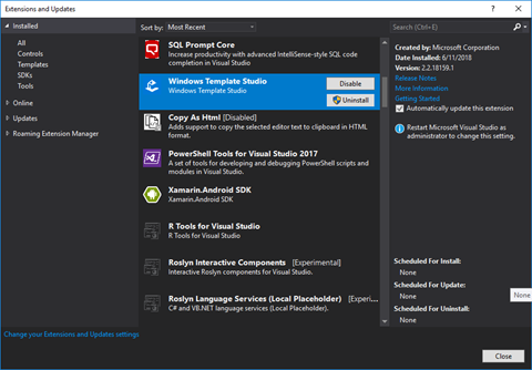
You can install the latest version of Windows Template Studio from the Visual Studio Marketplace or in Visual Studio's extension manager.

wts22-00-extension

Let's walk through the new project creation process with Windows Template Studio in Visual Studio 2017. Start with File-->New Project.

wts22-01-newprojwindow

Select the Windows Template Studio (Universal Windows) project type, give your project a name and click OK. Next you'll start with the project wizard.

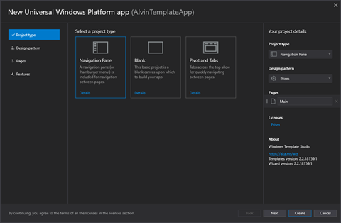
wts22-02-projtype

Start the wizard by choosing your project type.

  • Navigation Pane
  • Blank
  • Pivot and Tabs

I'm going to select the Navigation Pane type, which gives you a familiar left navigation area with a hamburger menu. Select Next to move on to Design Pattern.

wts22-03-designpattern

Choose your project's design pattern/package.

  • Code Behind
  • MVVM Light
  • MVVM Basic
  • Caliburn.Micro
  • Prism

I usually choose MVVM Light for my sample applications and other simple projects. Today I am going to select Prism to see what is generated by Windows Template Studio for this pattern.

Click Next to move on to selecting what types of pages to include in your application.

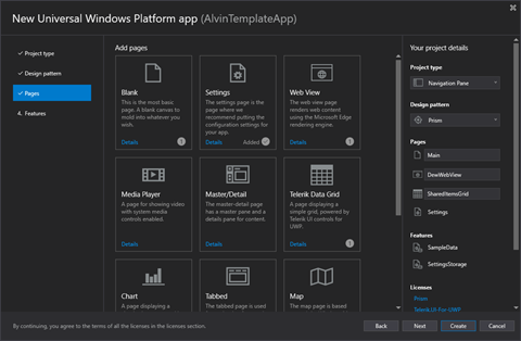
wts22-04-pages1

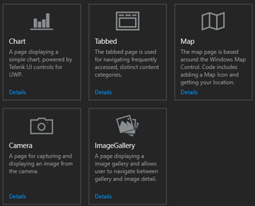
wts22-05-pages2

There are eleven types of pages from which to choose. Select the ones to be included in your project.

  • Blank
  • Settings
  • Web View
  • Media Player
  • Master/Detail
  • Telerik Data Grid
  • Chart
  • Tabbed
  • Map
  • Camera
  • Image Gallery

In addition to the default Main page selected, I've chosen to add a Web View named DewWebViewPage, a Settings page, and a Telerik Grid Page named SharedItemsGridPage.

Click Next again and we'll finish up by selecting some optional features to add to the app.

wts22-06-features1

wts22-07-features2

wts22-08-features3

wts22-09-features4

wts22-10-features5

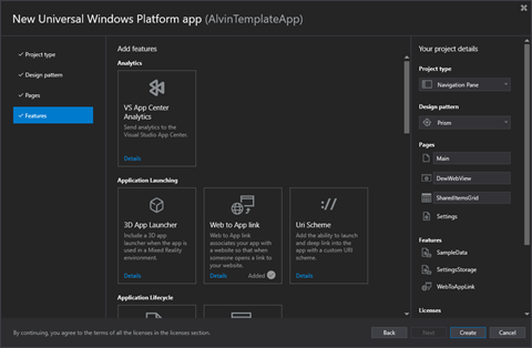
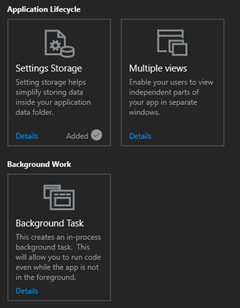
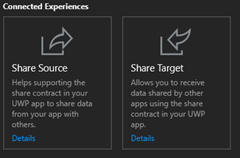
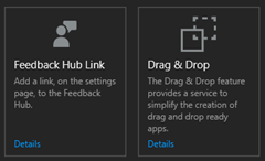
Version 2.2 now has 17 features to select for your app. Pick the ones that best suit your application's needs and feature set and click Finish to generate your project.

Now that the project has been created, you should see the default UWP welcome screen with some helpful links and your Solution Explorer. I'm going to start by taking a look at what NuGet packages were added for my project.

wts22-11-packages

Based on my wizard selections, I have a handful of packages referenced by my project, including those for Prism.Unity and Telerik.UI.UWP. Your result will vary based on the pattern, pages and features selected for your project.

Next, let's expand a few of the project folders to examine the files created for the project.

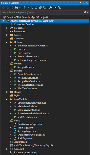
wts22-12-solution

You should see a View and corresponding ViewModel for each of the Pages you selected for your app, assuming you did not select the Code Behind pattern. In that case, there will be no ViewModel classes.

The Services and Helpers will also vary from those above based on your feature selections.

In my case, there is a SampleOrder in the Models folder for use with the Data Grid. This will be changed to mirror the actual model to be used in the application's grid. The SampleDataService and its corresponding interface will be used to populate the grid. The WebView also has a service and a service interface for testability.

Run the app and try it out. All of the base navigation functionality is there and works great.

The Main Page

wts22-13-run

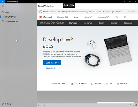
The WebView

wts22-14-runwebview

The Data Grid

wts22-15-rungrid

The Settings… let's change to the Dark Theme while we're in here.

wts22-16-runsettings

That's it for the basics. Stay tuned for the next part where we will examine some of the code files and make some tweaks to make it fit your application's requirements.


Happy coding!

Monday, June 4, 2018

UWP Tip #20 - Windows Community Toolkit - Part 16, InfiniteCanvas

Welcome back to my Windows Community Toolkit series, formerly known as the UWP Community Toolkit series (see this post). The previous five tips in the series can be found here:

Intro

The Windows Community Toolkit v3 was a major update for the toolkit. In addition to adding and enhancing many of the extensions, animations, helpers and services, it has added several new controls.

I will examine these new controls over the next several tips in the series. We will circle back to some of the other types of features in the toolkit later. Today, let's start with the InfiniteCanvas.

Using InfiniteCanvas

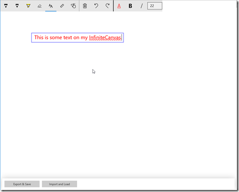
The new InfiniteCanvas control for UWP applications is a rich, polished and powerful control. Out of the box it supports inking, text entry & formatting, zooming, undo/redo and of course infinite scrolling (hence the name). You can also import and export the InfiniteCanvas contents as json.

Take a look at the InfiniteCanvas running in the latest version of the Windows Community Toolkit Sample App.

UWPTIps-InfiniteCanvas1

Notice that, like other text input controls in UWP apps, the text input in InfiniteCanvas supports spell checking. The toolbar on the control can be toggled on and off with the IsToolbarVisible property. You might want to bind that property so that it is only True when a particular part of your app has focus. Dropping the control into a Grid with the default functionality and a visible toolbar is as simple as:

<Grid>
   <wctk:InfiniteCanvas IsToolbarVisible="True"/> </Grid>

The import/export functionality is performed by calling a pair of methods. ImportFromJson(string json) takes a string containing the data to display on the canvas. ExportAsJson() takes no parameters and returns a string with the json data representing the objects currently on the canvas. Exporting an empty canvas results in a json string with only an empty pair of square brackets.

Zooming bounds can be controlled with the MinZoomFactor and MaxZoomFactor properties. The Min can be set to a System.Double between 0.1 and 1 with a default of 0.25. The Max can be set to a double between 1 and 10 with the default being 4.

The other properties currently available on the control are CanvasHeight and CanvasWidth. These provide access to the size of the drawing surface, rather than the Height and Width of the InfiniteCanvas control itself. Go check out the documentation for a complete listing of the API surface of the control.

Wrap Up

Go check out the source code for InfiniteCanvas, download the latest toolkit NuGet packages, and give it a try in your UWP application today.


Happy coding!


del.icio.us Tags: ,

Thursday, May 31, 2018

TechBash 2018 - Early Bird 3-day and 4-day tickets now available

4-day (with Workshop) and 3-day early bird tickets are now on sale for TechBash 2018. This year TechBash will be held October 2-5, with the 2nd being a pre-conference day of full-day workshops for 4-day ticket holders only. These workshops will be presented by top experts in each area. The topics from which to choose are ASP.NET Core 2.1, DevOps, Docker and Azure for Developers. Get more workshop info here.

Early bird tickets will save up to 25% off the Standard ticket price this year. Don't wait because these prices will only be available for a few weeks and space in each workshop is limited. This year's keynote presenter is Scott Hunter, leader of the Visual Studio and .NET Teams at Microsoft, and these other speakers have already been confirmed:

  • Jeremy Likness
  • Jessica Deen
  • Richard Taylor
  • Chris Woodruff
  • Jeremy Clark
  • Anna Bateman
  • Brendan Enrick
  • John Wright
  • Ashley Grant
  • Ivana Veliskova
  • Steve Bohlen
  • Angel Thomas
  • Jim Wooley
  • Walt Ritscher
  • Paul Hacker
  • Jeff Fritz
  • Mitch Denny
  • Anoop Kumar

The full lineup will be announced soon. Get more info about TechBash here and buy your tickets today!

See you this fall at the Kalahari Resort in the Poconos! Get more info about TechBash's great room rates at the Kalahari on this page.


Friday, May 18, 2018

UWP Tip #19 - The Windows Community Toolkit

Hello UWP developers!

We take a quick break from our UWP Community Toolkit tips series because the toolkit has been given a new name this month! The UWP Community Toolkit is now called the Windows Community Toolkit.

The new name is a reflection of the renewed focus of the project - enabling Windows developers to quickly build awesome applications for Windows 10. The scope of the toolkit will be broadening to encompass controls, components and helpers for UWP, WPF, WinForm, Xamarin.Form and more. Long story short, if you are building for Windows and can consume a .NET Standard library, the Windows Community Toolkit aims to help you succeed.

Everything has been renamed - the documentation and the GitHub repository for now, and soon the sample app.

The next major update of the toolkit (v3.0) is coming soon. If you take a look at the milestones on GitHub, there's a code freeze for 3.0 on May 23rd and the target date for the release is May 30th. I see some interesting features in the list of issues for this release including a dark theme for the sample app and an InfiniteCanvas control.

Go check out the announcement on the Windows Developer Blog from earlier this month to get all the information about the name change. As soon as the new release is out, I'll be back with some more tips and tricks for using the new controls and helpers.

If you want to help build the toolkit, check out the list of open issues and submit a PR!


Friday, April 27, 2018

Microsoft Build 2018 - Interesting Sessions for Windows Developers

Microsoft Build 2018 is coming in just a few days, and the sessions have been published. While I am unable to attend this year, I plan to watch the keynote live and many of the other recorded sessions later in the week.

I decided to browse the session listings and start building a list of the ones that interest me as a Windows developer. Here is what I have so far, in no particular order.

THR2407-1 - Amazing experiences and how to build them – from the people building showcases and demos - Part 1
and
THR2407-2 - Amazing experiences and how to build them – from the people building showcases and demos - Part 2

Microsoft technologies enable end to end experiences that help you build successful solutions to empower your users at home and at work. Presented in the #ifdef WINDOWS format, this zero-slide, fast paced demo session will show you why and how some of these new technologies such as Microsoft Graph, Progressive Web Apps, Fluent Design, Windows Machine Learning, Mixed reality, new cloud services (and much more) can work together to extend your application to reach new users and increase user productivity. Watch the promo here.

TSP2107 - Bringing cloud powered UI to Windows 10 XAML applications

The Windows 10 platform team is exploring the developer landscape of bringing cloud powered UI content natively to Windows 10 applications and how ReactNative as a model fits into that overall story. We would like to share some early sneak peaks and get your feedback on what you would like to see as platform investments in this space.

BRK3503 - Creating Innovative Experiences for Fluent Design using the Visual Layer

Explore how to create engaging Windows applications by incorporating effects, animations, and new types of content that form the building blocks for the Fluent Design System. This session showcases new platform capabilities that enable you to craft innovative 2D and 3D experiences using volumetric objects, vector graphics, depth, motion, lights, and materials. Learn how to bring differentiated UI to your application, tailored for a wide range of Windows devices.

TSP2108 - Open source and backward compatibility for the Windows 10 XAML framework

The Windows 10 platform team is considering updating our engineering process to release parts of the Windows 10 XAML / Fluent UI framework as open source packages that provide backward compatibility for a wider range of Windows 10 versions. We would like to share some options we’re considering and get feedback on what would be most useful to you.

TSP2109 - What could be next for the Windows Community Toolkit

The Windows Community Toolkit continues to grow, with packages that extend to new areas of Windows development being added with each new release. Join us as we envision where else we can partner with the community and what could the toolkit do in 6 months and beyond.

BRK2423 - What's New for Windows UX Developers: Fluent and XAML

Join us for a lap around the new innovations coming to the Windows ux platform this year. Catch up on the latest UWP APIs and how you can use familiar technologies like XAML and C# to build experiences that leverage the Fluent Design System to captivate your customers and maximize their productivity. This must-see session will cover improvements in ux fundamentals; new controls for navigation, commanding, collections, and forms; enhancements to developer productivity; and more!

TSP2112 - Windows Template Studio

Windows Template Studio continues to add new features and abilities. We're always looking to help prioritize and validate big work items such as additional frameworks and platforms. Join us as we envision where else we can partner with the community and what could the toolkit do in 6 months and beyond.

BRK2401 - Adaptive Cards in Bots, Windows, Outlook and your own applications

Adaptive Cards is a new, simple yet highly capable declarative format that makes it a breeze to display rich card-like interfaces in any application. Learn how Bots, Windows and Outlook use the power of Adaptive cards to showcase information from applications like yours. Using the same technology, your application can do the same to help create interactive and actionable experiences that are both engaging and can simplify business processes across your organization.

TSP2101 - Build hybrid applications faster and better on Windows

This sessions explores the patterns, tools and frameworks that developers utilize to build Hybrid Applications on Windows. We will talk about the platform and tooling updates we could potentially make to improve the overall Hybrid App development experience on Windows. If you are a desktop app developer leveraging a combination of technology stacks like web, native (UWP, WPF), React, etc. , stop by and share your thoughts on what we can do to help you be more productive.

BRK2412 Developing for Sets on Windows 10

Sets helps users be more productive by helping them to focus better and to pick up where they left off. Learn how Windows automatically integrates your apps with Sets to help users be more productive, and learn about opportunities to enrich your Windows applications to provide even more engaging experiences through User Activities, branded tab visuals, and new windowing features. Make your applications amazing in Sets!

BRK2413 Fluent Design: Evolving our Design System

Microsoft has continued to evolve the Fluent Design System’s set of controls, patterns, principles and design guidance since its debut at Build 2017. Get a hands-on look at how 1st-party Microsoft experiences are taking advantage of the system and empowering their users to achieve more by crafting experiences that are natural on each device, intuitive, powerful, engaging, and immersive. Come learn how you can build experiences with the latest Fluent Design features to help your users do more in our multi-device, multi-sensory world.

BRK3501 Modernizing Desktop Apps on Windows 10

Come learn about the future of your WPF & Windows Forms applications. Windows, .NET and Visual Studio are making it easy to incrementally modernize your existing applications with Windows 10 features. Containerize your application for compatibility and installation isolation and begin integrating new Windows 10 UI features with just a few clicks in Visual Studio. Modern applications are deeply connected to the people you work with and know which devices you’re using. We will cover the ways the Microsoft Graph allow your existing application to connect users and help them complete tasks as well.

BRK2432 MSIX: Inside and Out

MSIX is the future of app installation building on top of and fully compatible with existing appx mechanisms. It provides a cross-platform, down level compliant, enterprise class installer with benefits ranging from existing LOB apps, distribution through the Microsoft Store, Store for Business, or other custom distribution methods. Come see why MSIX brings the best of MSI, Click Once, App-V and APPX together for your customers and business.

THR3306 Tying it all together – Modernizing Enterprise Applications

Enterprise developers face many challenges in today's environment as many applications are planning for capabilities and growth via the cloud.  This session will show you how to make sure your application is architected to continue working on the desktop on-prem as well as move to the cloud and easily add new device endpoints when you are ready.  We will also cover new tooling in VS that helps you start new projects on the right track or update existing probjects with containers, REST interfaces, and accessing data in the cloud.

...and a few to indulge my Mac and Xamarin interests.


THR2021 Visual Studio for Mac Tips & Tricks

Visual Studio for Mac is the Microsoft IDE natively designed for the Mac. You get everything you need for mobile, web, game and cloud development with C# and F#, with rich support for Xamarin, .NET Core, Unity and Azure development. In this session, come hang out with Jordan as he takes you through tips and tricks to help you get the most out of Visual Studio for Mac. This one's for beginners and experts alike!

BRK2152 What's new with Visual Studio for Mac

Visual Studio for Mac launched last year at Build as the Microsoft IDE natively designed for the Mac. Since then, regular releases have added improvements and features for .NET Core 2.0, Azure Functions, Docker, and more. Join us in this session to get a whirlwind tour of what is new and also learn about what’s coming in Visual Studio for Mac to make .NET developers even more productive on the Mac.

BRK2437 - What’s new in Xamarin.Forms 3.0

Xamarin.Forms enables you to build a native UI for multiple platforms with one shared C# and XAML codebase. Simply put, if you know C# then you already know how to build Android, iOS, and Windows apps. In this session come find out what is new, next, and absolutely awesome in Xamarin.Forms 3.0.

If you're not attending Build this year, be sure to catch it online. If you are attending live in Seattle, then I'm super-jealous! Enjoy your week of learning and networking!


Friday, March 30, 2018

UWP Tip #18 - UWP Community Toolkit - Part 15, Markdown Parser

Welcome back to my UWP Community Toolkit series. The previous five tips in the series can be found here:

Intro

As I mentioned in my last post, Part 14, the UWP Community Toolkit includes a pair of helper classes for parsing, one for parsing RSS data and the other for parsing markdown. Let's take a look into the Markdown Parser helper this time.

Markdown Parser

The Markdown parser includes a helper class to take a markdown string, parse it into a Markdown Document and then render that document into your UWP controls with a Markdown Renderer.
(Tip: The toolkit's MarkdownTextBlock also uses the MarkdownDocument and MarkdownRenderer classes. When you use the control, you can use this default renderer or set your own that overrides the MarkdownRendererBase.)
The UWP Community Toolkit Sample App includes this simple example of the Markdown Parser in action.

UWPmarkdownparser1

In this example, you see the raw markdown "This is **Markdown**". That text was parsed into a MarkdownDocument. The document was then serialized to JSON and displayed in a TextBlock. Here is that code from the sample app:

private void UpdateMDResult()

{
     var document = new MarkdownDocument();
     document.Parse(RawMarkdown.Text);
    var json = JsonConvert.SerializeObject(document, Formatting.Indented, new StringEnumConverter());
     MarkdownResult.Text = json;

}

You can see that creating the document is as simple as instantiating a new MarkdownDocument and calling Parse with your raw text. Once you have a MarkdownDocument, you can very easily manipulate it to add, modify or remove individual blocks or elements. The document is essentially a list of markdown blocks. In fact, the sole property you need to be concerned with on MarkdownDocument is Blocks (an IList<MarkdownBlock>).

Objects that derive from MarkdownBlock are MarkdownDocument or one of the following block types:
  • CodeBlock
  • HeaderBlock
  • HorizontalRuleBlock
  • LinkReferenceBlock
  • ListBlock
  • ParagraphBlock
  • QuoteBlock
  • TableBlock
The purpose of each type is fairly self-explanatory. If you need to manipulate one of these blocks, you would find the target block in the Blocks list and add/remove/modify/replace it, as necessary. Let's take a closer look at the LinkReferenceBlock. This block consists of the following properties to hold the link information:
  • Id - A unique string id to identify the reference link.
  • Tooltip - The link's tooltip to be displayed when rendered.
  • Url - The target.
  • Value - The text value to display for the link.
  • Type - This is inherited from the MarkdownBlock base and would return the type of this particular block.
I would encourage you to explore the other block types on GitHub if you plan on implementing your own renderer or markdown control.

Wrap-Up

I encourage you to explore the Markdown Parser on MS Docs and GitHub when you have a chance. If you have any ideas to enhance this parser or any part of the toolkit, submit an issue or submit a pull request.

Happy coding!

Friday, March 16, 2018

UWP Tip #17 - UWP Community Toolkit - Part 14, RSS Parser

Welcome back to my UWP Community Toolkit series. The previous five tips in the series can be found here:

Intro

The toolkit now includes two helper classes for parsing, one for parsing RSS feed data and the other for parsing markdown. These parsers simplify working with each of these formats. Today we will examine the RSS Parser helper.

RSS Parser

The RSS Parser helper consists of two classes. An RssParser which takes RSS feed data and does the parsing into a list of feed items. The RssParser has a parameterless constructor and a single Parse method which takes the feed data as a string and returns an IEnumerable<RssSchema>.

RssSchema is the other class included with the helper and is the representation of a feed item. The RssSchema has a parameterless constructor and the following properties:
  • Author
  • Content
  • ExtraImageUrl
  • FeedUrl
  • ImageUrl
  • MediaUrl
  • PublishDate
  • Summary
  • Title
If you are familiar with RSS data, these properties should all be familiar. Each is a string type except for PublishDate, which is a DateTime.

I created a simple static helper method which takes a string containing feed data returned from an HttpClient call and returns a list of feed items (RssSchema).

public static IList<RssSchema> ParseRssFeed(string feed)
{
     if (string.IsNullOrWhiteSpace(feed))
     {
         throw new ArgumentException("Feed cannot be empty.", nameof(feed));
     }
     var parser = new RssParser();
     var rssItems = parser.Parse(feed).ToList();

     // Loop to illustrate some of the available properties
     foreach (var item in rssItems)
     {
         Debug.WriteLine($"Title: {item.Title}");
         Debug.WriteLine($"Author: {item.Author}");
         Debug.WriteLine($"Summary: {item.Summary}");
     }
     return rssItems;
}

The foreach loop is unnecessary unless you were actively debugging an issues with a particular feed being parsed. The method could end before the loop with:

return parser.Parse(feed).ToList();

Wrap-Up

There isn't much to explain with this helper. It saves you a bit of parsing and provides a class representation of a feed item. While it is a simple helper, the RSS Parser is particularly interesting to me. I am always looking for ways to leverage RSS data to improve the workflow for creating blog posts for my other blog, the Morning Dew. The UWP companion app for that blog is rather basic and sorely in need of a refresh. Helpers like these provide a little extra motivation to go out and make some progress on Morning Dew UWP vNext.

Go check out the source and give the RSS Parser a try today!

Happy coding!

del.icio.us Tags: ,

Sunday, February 18, 2018

UWP Tip #16 - UWP Community Toolkit - Part 13, the Loading… Control

Welcome back to my UWP Community Toolkit series. The previous five tips in the series can be found here:
Here's a quick tip about a straightforward but useful control. The UWP Community Toolkit has a Loading control to indicate that your UWP app is currently loading some content. Drop this into your Page or Control and make it visible when data is loading and you want to prevent users from interacting with the application.

I created a Page with a Grid containing a ListBox and a Loading control. The ListBox gets loaded with a list of animals during load and the Loading control has its IsLoading property set to true. This is the property you would normally toggle on and off while a long-running load process is occurring. Here's a look at the XAML:

<Grid Background="{ThemeResource ApplicationPageBackgroundThemeBrush}">
     <ListBox x:Name="MainItemsList"/>
    <controls:Loading x:Name="MainLoadingControl" HorizontalContentAlignment="Center" 
                       VerticalContentAlignment="Center" Background="DarkGray" Opacity="0.8">
         <StackPanel Orientation="Horizontal" Padding="8">
             <ProgressRing IsActive="True" Margin="0,0,10,0" Foreground="CadetBlue" />
             <TextBlock Text="Loading control with wait ring. Loading..." VerticalAlignment="Center" Foreground="White"/>
         </StackPanel>
     </controls:Loading>
</Grid>

Inside the Loading control, you can set any content you want to display for your users during the wait interval. I've chosen a horizontal StackPanel with a ProgressRing and TextBlock. Of course, a production app would probably move the content of this panel into a shared resource that could dynamically set the text of the TextBlock based on the current context of the wait/load period.

This is the code from the Page's code behind file to load the list items and display the loading panel.

private void MainPage_Loaded(object sender, RoutedEventArgs e)
{
     var listItems = new List<string>
     {
         "Item 1 - Dog",
         "Item 2 - Hamster",
         "Item 3 - Rat",
         "Item 4 - Cat",
         "Item 5 - Lizard",
         "Item 6 - Guinea Pig",
         "Item 7 - Snake",
         "Item 8 - Turtle",
         "Item 9 - Bird",
         "Item 10 - Gerbil",
         "Item 11 - Mouse",
         "Item 12 - Fish"
     };
    MainItemsList.ItemsSource = listItems;
    MainLoadingControl.IsLoading = true;
}

Again, best practices outside of a sample app would have these list items inside an ObservableCollection in the corresponding view model. The IsLoading property would also be bound to a boolean in your view model to be toggled on/off as necessary.

This is the end result of our basic list behind a Loading control.

UWPToolkit-LoadingControl1

It looks pretty slick for a few lines of code in a sample app. Go download the latest Toolkit in your UWP app and give it a try today. The GitHub source for the control can be found here.

Happy coding!

Technorati Tags: ,

Monday, January 29, 2018

UWP Tip #15 - UWP Community Toolkit - Part 12, Working with Headings

Welcome back to my UWP Community Toolkit series. The previous five tips in the series can be found here:

Intro

The UWP Community Toolkit has a few controls to add headers to your WPF application's content. Drop this into your app and add a little styling to match their look to the rest of your app and you'll quickly and easily save time creating repetitive markup throughout your UI.

The HeaderedContentControl

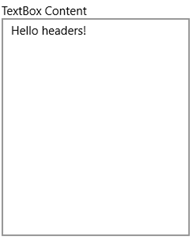
The HeaderedContentControl provides the base functionality for the other headered controls. It will display a header along with any content. Wrap any of your existing controls with this one to quickly add some header text. Here's an example of the HeaderedContentControl containing a TextBox.

<HeaderedContentControl Header="TextBox Content"
                                     HorizontalContentAlignment="Stretch"
                                     VerticalContentAlignment="Stretch"
                                     Margin="4">
     <TextBox Text="Hello headers!"/>
</HeaderedContentControl>

That markup will render the following UI in your WPF Window:

UWPTK-Headers3

Pretty simple. As you'll see in the next section, it is also pretty simple to add some style to the header text too.

The HeaderedItemsControl

The HeaderedItemsControl providers all of the functionality of a standard ItemsControl with a header added above the items. It's a HeaderedContentControl but the content is always an ItemsControl. Set the Header text property and the ItemsSource to your list of items, and you're all set. You can drop this in place of any of your existing ItemsControls and re-use the same ItemTemplate to achieve an identical look and feel of the list items.

With any of the headered controls, the header itself can also be customized be assigning a DataTemplate to the HeaderTemplate, in this case the HeaderedItemsControl.HeaderTemplate.

Here's the simplest use of the control, with the Header hard-coded and the ItemsSource bound to a collection in the DataContext.

<controls:HeaderedItemsControl Header="Some Items" 
                                 ItemsSource="{Binding SomeItems}" >

Take a look at a couple of HeaderedItemsControls in the UWP Community Toolkit Sample App. The first list's XAML is as simple as mine above. The second add a little custom layout to the header and the list.

UWPTK-Headers2

Here's the markup to add the blue foreground to the second header.

<HeaderedItemsControl.HeaderTemplate>
     <DataTemplate>
         <TextBlock DataContext="{Binding DataContext, ElementName=Page, Mode=OneWay}"
                    FontSize="16"
                    Foreground="Blue"
                    Text="Header 2" />
     </DataTemplate>
</HeaderedItemsControl.HeaderTemplate>

The HeaderedTextBlock

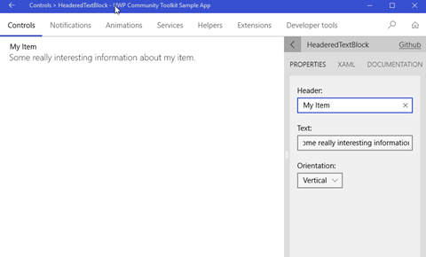
The HeaderedTextBlock control providers a quick way to display some read-only text with some corresponding header text. It's a HeaderedContentControl but the content is always a TextBlock. The three properties you need to know are straightforward: Header, Text and Orientation. You can lay out the header and text in a Horizontal or Vertical layout, the Vertical being the most common use.

Check it out in the Sample App.

UWPTK-Headers1

Here's the corresponding XAML for the control.

<controls:HeaderedTextBlock 
     Header="My Item"
     Text="Some really interesting information about my item."
     Orientation="Vertical"
     Margin="20,10,0,0" />

A few of these controls is a great, simple way to lay out a read-only form on your app.

Wrap-Up

Go grab the latest toolkit packages via NuGet or browse the repo on GitHub today! There are many more controls you can use in your apps today. We'll check out a few more in a couple of weeks.


Happy coding!