Showing posts with label announcements. Show all posts

Friday, April 16, 2021

Announcing Learn WinUI 3.0 from Packt Publishing and a Contest

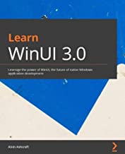
I'm thrilled to announce that my new book from Packt Publishing, Learn WinUI 3.0, was published in late March. You can buy your eBook or print copy today from Amazon or Packt's web site.


Windows UI (WinUI) 3 is Microsoft's next generation library for creating Windows applications with Fluent Design. WinUI 3 was released in March with Project Reunion 0.5 and is fully supported for building Win32 applications. Learn more about WinUI and Project Reunion on Microsoft Docs here.

I would like to thank Nick Randolph, who was the technical reviewer for the book. His feedback on the book's chapters and sample code were instrumental in delivering a great resource for Windows developers. I was lucky to have him involved in this project. If you aren't already following Nick's blog, go check it out now. He has been posting some great WinUI, Reunion, and Uno Platform content in recent weeks.

If you would like to win a print copy of Learn WinUI 3.0, read on. I am going to give away four copies of the book to readers of four of my blogs:

Leave a comment on this post on any of these blogs with the name of your favorite Windows or .NET development blogger. I will pick a random comment from each blog to select the four book winners. You can comment on each blog if you like, but please only comment once on each post. Comment moderation is enabled on all the blogs, so it could take a little time for your comment to appear. Make sure you sign up with a valid email address when leaving a comment. The contest closes at 11:59PM EDT on May 14th, 2021. I will ship books to winners worldwide. Please allow some time to receive the book if you are outside of the U.S.

Good luck and I hope you all enjoy my book! If you already have a copy, win one, or buy one, please leave honest ratings and reviews on Amazon. Thanks!

Thursday, August 9, 2018

UWP Tip #22 - Windows Community Toolkit 4.0 Released - DataGrid Is Ready For Your Production Apps

New Release

It's another milestone for the Windows Community Toolkit. Yesterday on the Windows Developer blog, Nikola Metulev announced that the Windows Community Toolkit v4.0 had been released. These are the major changes, according to the release notes on GitHub:
  • DataGrid control is now released out of preview
  • 2 Microsoft Graph controls were added:
  • WebView control enhancements
  • Services (Twitter, LinkedIn, MS Translator) moved Microsoft.Toolkit.Services. Anyone targeting .NET Standard 1.4 can now use these.
  • Twitter service enhanced to include some missing properties from Twitter tweet API
  • Windows Community Toolkit Sample App updated to implement fluent design and a dark theme!
  • Assembly strong naming
  • Dozens of bug fixes in controls, helpers, services and documentation

DataGrid Control

The DataGrid XAML control feel be immediately familiar to any developers who have used the Silverlight DataGrid. This control shares the functionality of the old Silverlight control. In fact, the docs for the DataGrid actually link to the Silverlight DataGrid's API for reference.
As usual, Microsoft's docs are a great place to start. There are eight How-To's for the DataGrid available, so I won't provide my own simple walkthrough here. Instead, let's explore DataGrid in the newly updated Windows Community Toolkit Sample App.
Open the sample app, and select the DataGrid from the Controls menu.
DataGrid01
As you can see, I'm already taking advantage of the addition of the dark theme support in the latest release of sample app.
You'll be presented with a DataGrid control filled with data about mountains. Let's take a minute to thank the developers who worked on the sample app for not providing users with yet another invoicing or inventory set of data.
DataGrid02
Speaking of Themes, did you notice another new feature of the sample app? You can select System, Light or Dark to apply themes to the individual controls displayed within the sample app. How useful!
Just below this, in the header area just above the DataGrid itself, users are able to Filter or Group the grid data with a set of AppBarButton controls. This is the default code for the header:
<StackPanel Orientation="Horizontal" Margin="12">
   <TextBlock Text="DataGrid Sample : Mountains" VerticalAlignment="Center" Margin="5,0" Style="{ThemeResource SubtitleTextBlockStyle}"></TextBlock>
   <AppBarButton Icon="Filter" Label="Filter by">
     <AppBarButton.Flyout>
       <MenuFlyout>
         <MenuFlyoutItem x:Name="rankLow" Text="Rank &lt; 50" />
         <MenuFlyoutItem x:Name="rankHigh" Text="Rank &gt; 50" />
         <MenuFlyoutSeparator />
         <MenuFlyoutItem x:Name="heightLow" Text="Height &lt; 8000ft" />
         <MenuFlyoutItem x:Name="heightHigh" Text="Height &gt; 8000ft" />
       </MenuFlyout>
     </AppBarButton.Flyout>
   </AppBarButton>
   <AppBarButton x:Name="groupButton" Icon="List" Label="Group by" />

</StackPanel>

The code for the DataGrid primarily consists of a number or properties and then a DataGridTextColumn for each column added to the control. Here's that code:
<controls:DataGrid
   Grid.Row="1"
     x:Name="dataGrid"
     Margin="12"
     VerticalAlignment="Stretch" HorizontalAlignment="Stretch"
     HorizontalScrollBarVisibility="Visible"
     VerticalScrollBarVisibility="Visible"
     AlternatingRowBackground="Transparent"
     AlternatingRowForeground="Gray"
     AreRowDetailsFrozen="False"
     AreRowGroupHeadersFrozen="True"
     AutoGenerateColumns="False"
     CanUserSortColumns="False"
     CanUserReorderColumns="True"
     CanUserResizeColumns="True"
     ColumnHeaderHeight="32"
     MaxColumnWidth="400"
     FrozenColumnCount="0"
     GridLinesVisibility="None"
     HeadersVisibility="Column"
     IsReadOnly="False"
     RowDetailsTemplate="{StaticResource RowDetailsTemplate}"
     RowDetailsVisibilityMode="Collapsed"
     SelectionMode="Extended"
     RowGroupHeaderPropertyNameAlternative="Range">
   <controls:DataGrid.Columns>
     <controls:DataGridTextColumn Header="Rank" Binding="{Binding Rank}" Tag="Rank" />
     <controls:DataGridTextColumn Header="Mountain" Binding="{Binding Mountain}" Tag="Mountain" />
     <controls:DataGridTextColumn Header="Height (m)" Binding="{Binding Height_m}" Tag="Height_m" />
     <controls:DataGridTextColumn Header="Range" Binding="{Binding Range}" Tag="Range" />
     <controls:DataGridTextColumn Header="Parent Mountain" Binding="{Binding Parent_mountain}" Tag="Parent_mountain" />
   </controls:DataGrid.Columns>

</controls:DataGrid>

For the purposes of a sample app, everything but the grid data is hard coded. Your app could certainly bind any of these properties that you would like to either load from saved configuration or user preferences.
Let's round out our look at the sample app's code by reviewing the DataTemplate for the row details.
<DataTemplate x:Key="RowDetailsTemplate">
   <StackPanel>
     <TextBlock Margin="20" Text="Here are the details for the selected mountain:" />
     <Grid Margin="20,10" Padding="5">
       <Grid.RowDefinitions>
         <RowDefinition Height="Auto" />
         <RowDefinition Height="Auto" />
         <RowDefinition Height="Auto" />
         <RowDefinition Height="*" />
       </Grid.RowDefinitions>
       <Grid.ColumnDefinitions>
         <ColumnDefinition Width="Auto" />
         <ColumnDefinition Width="Auto" />
       </Grid.ColumnDefinitions>
       <TextBlock Text="Coordinates: " FontWeight="SemiBold" FontSize="13" />
       <TextBlock Grid.Row="1" Text="Prominence (m): " FontWeight="SemiBold" FontSize="13" />
       <TextBlock Grid.Row="2" Text="First Ascent (year): " FontWeight="SemiBold" FontSize="13" />
       <TextBlock Grid.Row="3" Text="No. of ascents: " FontWeight="SemiBold" FontSize="13" />
       <TextBlock Grid.Column="1" FontSize="13" Text="{Binding Coordinates}" HorizontalAlignment="Right" />
       <TextBlock Grid.Row="1" Grid.Column="1" FontSize="13" Text="{Binding Prominence}" HorizontalAlignment="Right" />
       <TextBlock Grid.Row="2" Grid.Column="1" FontSize="13" Text="{Binding First_ascent}" HorizontalAlignment="Right" />
       <TextBlock Grid.Row="3" Grid.Column="1" FontSize="13" Text="{Binding Ascents}" HorizontalAlignment="Right" />
     </Grid>
   </StackPanel>

</DataTemplate>
If a user were to view details on a row, this is how the information would be displayed. The sample app does not appear to currently implement a way to display the RowDetailsTemplate in the UI.

Wrap-Up

Go explore the source code, read the docs and play with the sample app. Then add the DataGrid to your own Windows app! It's a powerful grid control that will save you loads of time.

Happy coding!

Friday, July 27, 2018

UWP App Tips Announcement - Windows UI LIbrary (WinUI)

Big news for Windows developers this week!

On Monday, the Windows Developer team announced the preview release of the Windows UI Library. Windows UI Library, or WinUI, is a set of NuGet packages which contain UWP XAML controls and other features which can be used across different versions of Windows 10. Many of these will be compatible with release from 1607 to the latest Insiders Fast Ring builds.

Windows developers will no longer need to wait for their users to adopt the latest Windows 10 release in order to provide some of the rich features provided by these packages, like Fluent controls.

WinUI preview currently consists of two NuGet packages:

  • Microsoft.UI.Xaml - Contains new and updated XAML controls for UWP applications.
  • Microsoft.UI.Xaml.Core.Direct - Provides access to XamlDirect APIs on versions of Windows 10 that do not yet support these APIs.

Want to get started with WinUI? Here's a quick step-by-step guide to creating a project, adding the NuGet packages, and adding a couple of the new XAML controls to your main Window. Want to add WinUI to an existing UWP project? As long as your project's Minimum version is at least 14393 and Target version is 17134 or later, you can follow the same steps to add the NuGet packages.

First, create your project in Visual Studio 2017 (VS 2015 is not supported).

WinUI01

Next, open the NuGet package management window for your project. Select Browse, and search for Microsoft.UI.Xaml. Be sure to select the "Include prerelease" checkbox next to the search field or you will see no results.

WinUI02

Add the packages you want to use. After adding Microsoft.UI.Xaml, a readme file will open advising you to add the following snippet to your project's App.xaml. Be sure you do this immediately after installing the package.

<Application.Resources>
     <XamlControlsResources xmlns="using:Microsoft.UI.Xaml.Controls"/>
</Application.Resources>

Now you can close your NuGet Package Manager and the readme.txt and App.xaml files. Let's add a couple of new and updated controls to MainPage.xaml. Start by adding a reference to your Page:

xmlns:winUiControls="using:Microsoft.UI.Xaml.Controls"

I've added a few controls to my Page, a TwoPaneView containing a SplitButton in Pane1 and a PersonPicture in Pane2.

<winUiControls:TwoPaneView>
     <winUiControls:TwoPaneView.Pane1>
         <Grid>
             <winUiControls:SplitButton Content="Click or Select" Margin="12"/>
         </Grid>
     </winUiControls:TwoPaneView.Pane1>
     <winUiControls:TwoPaneView.Pane2>
         <Grid>
             <winUiControls:PersonPicture/>
         </Grid>
     </winUiControls:TwoPaneView.Pane2>
</winUiControls:TwoPaneView>

The result is exactly what you would expect for this snippet.

WinUI03

So, what controls are included in the Microsoft.UI.Xaml package? If you open Object Browser, you will currently find a huge list classes under the Microsoft.UI.Xaml.Controls namespace. A few of the new and updated controls include:

  • ColorPicker
  • DropDownButton
  • SplitButton
  • LayoutPanel
  • MenuBar
  • NavigationView
  • ParallaxView
  • RatingControl
  • PersonPicture
  • Repeater
  • Scroller
  • SwipeItem
  • TreeView
  • TwoPaneView

Lots to love for sure. Documentation of the classes in this namespace can be found here, although much of it is currently limited and only labeled as prerelease.

Ready to play? Go check out the Getting Started article on MS Docs and the XAML Controls Gallery code on GitHub! Remember this is currently prerelease code and may undergo some change before it goes RTM.


Happy coding!


Thursday, May 31, 2018

TechBash 2018 - Early Bird 3-day and 4-day tickets now available

4-day (with Workshop) and 3-day early bird tickets are now on sale for TechBash 2018. This year TechBash will be held October 2-5, with the 2nd being a pre-conference day of full-day workshops for 4-day ticket holders only. These workshops will be presented by top experts in each area. The topics from which to choose are ASP.NET Core 2.1, DevOps, Docker and Azure for Developers. Get more workshop info here.

Early bird tickets will save up to 25% off the Standard ticket price this year. Don't wait because these prices will only be available for a few weeks and space in each workshop is limited. This year's keynote presenter is Scott Hunter, leader of the Visual Studio and .NET Teams at Microsoft, and these other speakers have already been confirmed:

  • Jeremy Likness
  • Jessica Deen
  • Richard Taylor
  • Chris Woodruff
  • Jeremy Clark
  • Anna Bateman
  • Brendan Enrick
  • John Wright
  • Ashley Grant
  • Ivana Veliskova
  • Steve Bohlen
  • Angel Thomas
  • Jim Wooley
  • Walt Ritscher
  • Paul Hacker
  • Jeff Fritz
  • Mitch Denny
  • Anoop Kumar

The full lineup will be announced soon. Get more info about TechBash here and buy your tickets today!

See you this fall at the Kalahari Resort in the Poconos! Get more info about TechBash's great room rates at the Kalahari on this page.


Friday, May 18, 2018

UWP Tip #19 - The Windows Community Toolkit

Hello UWP developers!

We take a quick break from our UWP Community Toolkit tips series because the toolkit has been given a new name this month! The UWP Community Toolkit is now called the Windows Community Toolkit.

The new name is a reflection of the renewed focus of the project - enabling Windows developers to quickly build awesome applications for Windows 10. The scope of the toolkit will be broadening to encompass controls, components and helpers for UWP, WPF, WinForm, Xamarin.Form and more. Long story short, if you are building for Windows and can consume a .NET Standard library, the Windows Community Toolkit aims to help you succeed.

Everything has been renamed - the documentation and the GitHub repository for now, and soon the sample app.

The next major update of the toolkit (v3.0) is coming soon. If you take a look at the milestones on GitHub, there's a code freeze for 3.0 on May 23rd and the target date for the release is May 30th. I see some interesting features in the list of issues for this release including a dark theme for the sample app and an InfiniteCanvas control.

Go check out the announcement on the Windows Developer Blog from earlier this month to get all the information about the name change. As soon as the new release is out, I'll be back with some more tips and tricks for using the new controls and helpers.

If you want to help build the toolkit, check out the list of open issues and submit a PR!


Friday, October 27, 2017

UWP News - The UWP Community Toolkit Cheese Has Moved

Hello UWP App Dev peeps!

If you've been following along with my UWP Community Toolkit tips, you may have noticed a few of the links are either dead or redirecting to other pages. This is happening because all UWP Community Toolkit information and documentation can now be found on docs.microsoft.com. Docs is now the home for all things documentation in the Microsoft development world, in case you haven't heard. The many of the old links on developer.microsoft.com are now redirecting to Docs.

I will be going back through my blog posts over the next couple of weeks to update links. Until that time, if you encounter a dead link, feel free to leave a comment on the post or reach out to me on Twitter. You can use the excellent search feature on docs.microsoft.com to find the docs for all the UWP Toolkit features and APIs.

The code itself still lives over on GitHub. Use this site to report issues, request enhancements or contribute to the toolkit yourself through a PR. You can also contribute to the documentation on the Docs site if you find anything missing, lacking depth, or altogether incorrect.

Thanks again for following along with the UWP App Dev Tips! You can expect to see a new tip in the next couple of days.


Cheers!

Thursday, October 12, 2017

UWP News - UWP in FCU Supports .NET Standard 2.0

Big news this week for UWP developers. If your app is targeting Windows 10.0.16299 (the Fall Creators Update), you can now access ~20,000 APIs that were added as part of .NET Standard 2.0.

The announcement was made during Windows Developer Day on Tuesday, and a .NET Blog post by Rich Lander and Immo Landwerth dives into some of the details.

In order to use .NET Standard 2.0 in UWP, you need to target Fall Creators Update (FCU) as the minimum version of your UWP project. That’s because .NET Standard 2.0 contains many APIs that require FCU to make them work in the context of the UWP execution environment, specifically AppContainer.

To get started, go upgrade to the Fall Creators Update, get the new Windows SDK and the new build of Visual Studio 2017 (v15.4). Get started building new UWP apps or updating your existing apps to support the FCU features and .NET Standard 2.0. Microsoft is offering some great prizes in a new contest to encourage Windows developers to target the FCU, including a Surface Studio. Get the contest details here.

Landwerth has also updated his .NET Standard Selector website to include .NET Standard and UWP. If you are unsure of which platforms are supported by each version of .NET Standard, check out this handy reference.

Happy coding!

Wednesday, August 30, 2017

UWP News - UWP Community Toolkit 2.0 has been released

This is just a quick break from the UWP Tips to let you know that the UWP Community Toolkit 2.0 has been released by Microsoft. There are a bunch of changes for developers and designers, including enhancements to support the Fluent Design System coming in the Windows 10 Fall Creators Update.

Go check out this post on the Windows blog for all the details.

Today, the UWP Community Toolkit graduates to version 2.0 and sets the stage for future releases.
There have been seven releases since the UWP Community Toolkit was first introduced exactly one year ago and version 2.0 is the first major and largest update to date. The developer community has worked enthusiastically to build something that is used by thousands of developers every month. Today, there are over 100 contributors, and developers have downloaded the packages over 250,000 times. This would not be possible without the strength of the community – Thank You!

If you want to skip the announcement and get coding, you can grab the latest on NuGet or check it out on GitHub.

Happy coding!

Monday, June 26, 2017

Welcome to UWP Tips - Quick tips and tricks for UWP app developers!

Hello!

Welcome to my latest creation. I hope you're already following The Morning Dew and WPF Tips. This new blog will follow a similar pattern to WPF Tips, but will focus on developing Windows Apps with UWP and someday soon XAML Standard too.

Expect to see new tips posted 2 to 3 times per month. I will share these links on the Dew Drop, so if you already follow me there, watch for links in the "XAML, UWP & Xamarin" section.

Thanks for reading and happy coding!


Alvin


del.icio.us Tags: ,,,
