Showing posts with label uwp community toolkit. Show all posts

Friday, March 30, 2018

UWP Tip #18 - UWP Community Toolkit - Part 15, Markdown Parser

Welcome back to my UWP Community Toolkit series. The previous five tips in the series can be found here:

Intro

As I mentioned in my last post, Part 14, the UWP Community Toolkit includes a pair of helper classes for parsing, one for parsing RSS data and the other for parsing markdown. Let's take a look into the Markdown Parser helper this time.

Markdown Parser

The Markdown parser includes a helper class to take a markdown string, parse it into a Markdown Document and then render that document into your UWP controls with a Markdown Renderer.
(Tip: The toolkit's MarkdownTextBlock also uses the MarkdownDocument and MarkdownRenderer classes. When you use the control, you can use this default renderer or set your own that overrides the MarkdownRendererBase.)
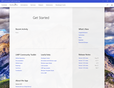
The UWP Community Toolkit Sample App includes this simple example of the Markdown Parser in action.

UWPmarkdownparser1

In this example, you see the raw markdown "This is **Markdown**". That text was parsed into a MarkdownDocument. The document was then serialized to JSON and displayed in a TextBlock. Here is that code from the sample app:

private void UpdateMDResult()

{
     var document = new MarkdownDocument();
     document.Parse(RawMarkdown.Text);
    var json = JsonConvert.SerializeObject(document, Formatting.Indented, new StringEnumConverter());
     MarkdownResult.Text = json;

}

You can see that creating the document is as simple as instantiating a new MarkdownDocument and calling Parse with your raw text. Once you have a MarkdownDocument, you can very easily manipulate it to add, modify or remove individual blocks or elements. The document is essentially a list of markdown blocks. In fact, the sole property you need to be concerned with on MarkdownDocument is Blocks (an IList<MarkdownBlock>).

Objects that derive from MarkdownBlock are MarkdownDocument or one of the following block types:
  • CodeBlock
  • HeaderBlock
  • HorizontalRuleBlock
  • LinkReferenceBlock
  • ListBlock
  • ParagraphBlock
  • QuoteBlock
  • TableBlock
The purpose of each type is fairly self-explanatory. If you need to manipulate one of these blocks, you would find the target block in the Blocks list and add/remove/modify/replace it, as necessary. Let's take a closer look at the LinkReferenceBlock. This block consists of the following properties to hold the link information:
  • Id - A unique string id to identify the reference link.
  • Tooltip - The link's tooltip to be displayed when rendered.
  • Url - The target.
  • Value - The text value to display for the link.
  • Type - This is inherited from the MarkdownBlock base and would return the type of this particular block.
I would encourage you to explore the other block types on GitHub if you plan on implementing your own renderer or markdown control.

Wrap-Up

I encourage you to explore the Markdown Parser on MS Docs and GitHub when you have a chance. If you have any ideas to enhance this parser or any part of the toolkit, submit an issue or submit a pull request.

Happy coding!

Friday, March 16, 2018

UWP Tip #17 - UWP Community Toolkit - Part 14, RSS Parser

Welcome back to my UWP Community Toolkit series. The previous five tips in the series can be found here:

Intro

The toolkit now includes two helper classes for parsing, one for parsing RSS feed data and the other for parsing markdown. These parsers simplify working with each of these formats. Today we will examine the RSS Parser helper.

RSS Parser

The RSS Parser helper consists of two classes. An RssParser which takes RSS feed data and does the parsing into a list of feed items. The RssParser has a parameterless constructor and a single Parse method which takes the feed data as a string and returns an IEnumerable<RssSchema>.

RssSchema is the other class included with the helper and is the representation of a feed item. The RssSchema has a parameterless constructor and the following properties:
  • Author
  • Content
  • ExtraImageUrl
  • FeedUrl
  • ImageUrl
  • MediaUrl
  • PublishDate
  • Summary
  • Title
If you are familiar with RSS data, these properties should all be familiar. Each is a string type except for PublishDate, which is a DateTime.

I created a simple static helper method which takes a string containing feed data returned from an HttpClient call and returns a list of feed items (RssSchema).

public static IList<RssSchema> ParseRssFeed(string feed)
{
     if (string.IsNullOrWhiteSpace(feed))
     {
         throw new ArgumentException("Feed cannot be empty.", nameof(feed));
     }
     var parser = new RssParser();
     var rssItems = parser.Parse(feed).ToList();

     // Loop to illustrate some of the available properties
     foreach (var item in rssItems)
     {
         Debug.WriteLine($"Title: {item.Title}");
         Debug.WriteLine($"Author: {item.Author}");
         Debug.WriteLine($"Summary: {item.Summary}");
     }
     return rssItems;
}

The foreach loop is unnecessary unless you were actively debugging an issues with a particular feed being parsed. The method could end before the loop with:

return parser.Parse(feed).ToList();

Wrap-Up

There isn't much to explain with this helper. It saves you a bit of parsing and provides a class representation of a feed item. While it is a simple helper, the RSS Parser is particularly interesting to me. I am always looking for ways to leverage RSS data to improve the workflow for creating blog posts for my other blog, the Morning Dew. The UWP companion app for that blog is rather basic and sorely in need of a refresh. Helpers like these provide a little extra motivation to go out and make some progress on Morning Dew UWP vNext.

Go check out the source and give the RSS Parser a try today!

Happy coding!

del.icio.us Tags: ,

Sunday, February 18, 2018

UWP Tip #16 - UWP Community Toolkit - Part 13, the Loading… Control

Welcome back to my UWP Community Toolkit series. The previous five tips in the series can be found here:
Here's a quick tip about a straightforward but useful control. The UWP Community Toolkit has a Loading control to indicate that your UWP app is currently loading some content. Drop this into your Page or Control and make it visible when data is loading and you want to prevent users from interacting with the application.

I created a Page with a Grid containing a ListBox and a Loading control. The ListBox gets loaded with a list of animals during load and the Loading control has its IsLoading property set to true. This is the property you would normally toggle on and off while a long-running load process is occurring. Here's a look at the XAML:

<Grid Background="{ThemeResource ApplicationPageBackgroundThemeBrush}">
     <ListBox x:Name="MainItemsList"/>
    <controls:Loading x:Name="MainLoadingControl" HorizontalContentAlignment="Center" 
                       VerticalContentAlignment="Center" Background="DarkGray" Opacity="0.8">
         <StackPanel Orientation="Horizontal" Padding="8">
             <ProgressRing IsActive="True" Margin="0,0,10,0" Foreground="CadetBlue" />
             <TextBlock Text="Loading control with wait ring. Loading..." VerticalAlignment="Center" Foreground="White"/>
         </StackPanel>
     </controls:Loading>
</Grid>

Inside the Loading control, you can set any content you want to display for your users during the wait interval. I've chosen a horizontal StackPanel with a ProgressRing and TextBlock. Of course, a production app would probably move the content of this panel into a shared resource that could dynamically set the text of the TextBlock based on the current context of the wait/load period.

This is the code from the Page's code behind file to load the list items and display the loading panel.

private void MainPage_Loaded(object sender, RoutedEventArgs e)
{
     var listItems = new List<string>
     {
         "Item 1 - Dog",
         "Item 2 - Hamster",
         "Item 3 - Rat",
         "Item 4 - Cat",
         "Item 5 - Lizard",
         "Item 6 - Guinea Pig",
         "Item 7 - Snake",
         "Item 8 - Turtle",
         "Item 9 - Bird",
         "Item 10 - Gerbil",
         "Item 11 - Mouse",
         "Item 12 - Fish"
     };
    MainItemsList.ItemsSource = listItems;
    MainLoadingControl.IsLoading = true;
}

Again, best practices outside of a sample app would have these list items inside an ObservableCollection in the corresponding view model. The IsLoading property would also be bound to a boolean in your view model to be toggled on/off as necessary.

This is the end result of our basic list behind a Loading control.

UWPToolkit-LoadingControl1

It looks pretty slick for a few lines of code in a sample app. Go download the latest Toolkit in your UWP app and give it a try today. The GitHub source for the control can be found here.

Happy coding!

Technorati Tags: ,

Monday, January 29, 2018

UWP Tip #15 - UWP Community Toolkit - Part 12, Working with Headings

Welcome back to my UWP Community Toolkit series. The previous five tips in the series can be found here:

Intro

The UWP Community Toolkit has a few controls to add headers to your WPF application's content. Drop this into your app and add a little styling to match their look to the rest of your app and you'll quickly and easily save time creating repetitive markup throughout your UI.

The HeaderedContentControl

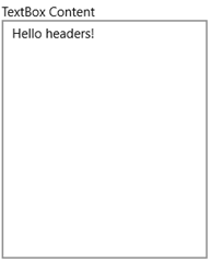
The HeaderedContentControl provides the base functionality for the other headered controls. It will display a header along with any content. Wrap any of your existing controls with this one to quickly add some header text. Here's an example of the HeaderedContentControl containing a TextBox.

<HeaderedContentControl Header="TextBox Content"
                                     HorizontalContentAlignment="Stretch"
                                     VerticalContentAlignment="Stretch"
                                     Margin="4">
     <TextBox Text="Hello headers!"/>
</HeaderedContentControl>

That markup will render the following UI in your WPF Window:

UWPTK-Headers3

Pretty simple. As you'll see in the next section, it is also pretty simple to add some style to the header text too.

The HeaderedItemsControl

The HeaderedItemsControl providers all of the functionality of a standard ItemsControl with a header added above the items. It's a HeaderedContentControl but the content is always an ItemsControl. Set the Header text property and the ItemsSource to your list of items, and you're all set. You can drop this in place of any of your existing ItemsControls and re-use the same ItemTemplate to achieve an identical look and feel of the list items.

With any of the headered controls, the header itself can also be customized be assigning a DataTemplate to the HeaderTemplate, in this case the HeaderedItemsControl.HeaderTemplate.

Here's the simplest use of the control, with the Header hard-coded and the ItemsSource bound to a collection in the DataContext.

<controls:HeaderedItemsControl Header="Some Items" 
                                 ItemsSource="{Binding SomeItems}" >

Take a look at a couple of HeaderedItemsControls in the UWP Community Toolkit Sample App. The first list's XAML is as simple as mine above. The second add a little custom layout to the header and the list.

UWPTK-Headers2

Here's the markup to add the blue foreground to the second header.

<HeaderedItemsControl.HeaderTemplate>
     <DataTemplate>
         <TextBlock DataContext="{Binding DataContext, ElementName=Page, Mode=OneWay}"
                    FontSize="16"
                    Foreground="Blue"
                    Text="Header 2" />
     </DataTemplate>
</HeaderedItemsControl.HeaderTemplate>

The HeaderedTextBlock

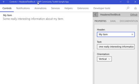
The HeaderedTextBlock control providers a quick way to display some read-only text with some corresponding header text. It's a HeaderedContentControl but the content is always a TextBlock. The three properties you need to know are straightforward: Header, Text and Orientation. You can lay out the header and text in a Horizontal or Vertical layout, the Vertical being the most common use.

Check it out in the Sample App.

UWPTK-Headers1

Here's the corresponding XAML for the control.

<controls:HeaderedTextBlock 
     Header="My Item"
     Text="Some really interesting information about my item."
     Orientation="Vertical"
     Margin="20,10,0,0" />

A few of these controls is a great, simple way to lay out a read-only form on your app.

Wrap-Up

Go grab the latest toolkit packages via NuGet or browse the repo on GitHub today! There are many more controls you can use in your apps today. We'll check out a few more in a couple of weeks.


Happy coding!


Tuesday, January 9, 2018

UWP Tip #14 - UWP Community Toolkit - Part 11, PullToRefreshListView Control

Welcome back to my UWP Community Toolkit series. The previous five tips in the series can be found here:

Intro

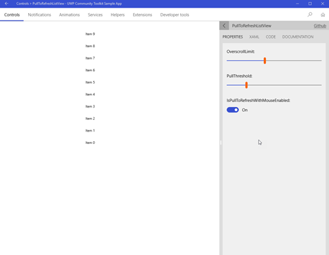
The PullToRefreshListView XAML control in the toolkit takes the familiar ListView and adds the pull-to-refresh functionality that widely used in touch-friendly UX. The PullToRefreshListView of course inherits from the ListView. Here is a look at the control running in the UWP Community Toolkit Sample App.

uwp-pulltorefresh1

Using the PullToRefreshListView Control

There are a few properties available to customize the pull-to-refresh experience for your users.

  • PullToRefreshLabel - Text shown when the user pulls down.
  • ReleaseToRefreshLabel - Text shown when the user can release (threshold has been reached).
  • PullToRefreshContent - Content shown when the user pulls down (Supersedes PullToRefreshLabel… it will not be shown).
  • ReleaseToRefreshContent - Content shown when the user can release (Supersedes ReleaseToRefeshLabel… it will not be shown).
  • RefreshIndicatorContent - The refresh indicator's content. This element will display when the list is refreshing.
  • PullThreshold - Distance in pixels that the content must be pulled to trigger a refresh on release.
  • OverscrollLimit - A System.Double between 0 and 1 which specifies the overscroll limit. The default value is 0.3.
  • IsPullToRefreshWithMouseEnabled - Indicates if the mouse can be used to trigger a pull-to-refresh. If this is false, touch must be used.

Here is the XAML for the control taken from the Sample Application. You can see that you create a DataTemplate for the item display like you would for any other ListView in UWP. The PullToRefreshContent is used instead of the label to allow for a custom TextBlock to be created.

<controls:PullToRefreshListView
         x:Name="ListView"
         MinWidth="200"
         Margin="24"
         HorizontalAlignment="Center"
         Background="White"
         OverscrollLimit="0.4"
         PullThreshold="100"
         IsPullToRefreshWithMouseEnabled="True">
   <controls:PullToRefreshListView.ItemTemplate>
     <DataTemplate>
       <TextBlock AutomationProperties.Name="{Binding Title}"
                  Style="{StaticResource CaptionTextBlockStyle}"
                  Text="{Binding Title}"
                  TextWrapping="WrapWholeWords" />
     </DataTemplate>
   </controls:PullToRefreshListView.ItemTemplate>
   <controls:PullToRefreshListView.PullToRefreshContent>
     <TextBlock FontSize="16"
                Opacity="0.5"
                Text="Pull down to refresh data" />
   </controls:PullToRefreshListView.PullToRefreshContent>
</controls:PullToRefreshListView>

There is a RefreshCommand that gets triggered when the refresh is triggered on release. This is where you will add your code in either the code behind or (preferably) the corresponding ViewModel. If you have a Refesh button or menu option someplace else in the View, the logic can be shared by both commands.

There is a also a PullProgressChanged you can use to update the RefreshIndicatorContent with the progress of a long-running refresh.

Wrap-Up

The PullToRefreshListView control is a great shortcut control to add a little extra something to your app with very little extra coding necessary. Go check it out today and spice up your UWP app's UX!


Happy coding!


del.icio.us Tags: ,,

Wednesday, December 27, 2017

UWP Tip #13 - 2017 Wrap-Up, Free Resources for #UWP Developers

Intro

With 2017 nearing an end, I wanted to share some of the UWP resources that I have used or evaluated this year. These are all either completely free or have a free version for personal/community use.

Resources

Universal Windows Platform Documentation - Get tips, tutorials for getting started, design guidance, the API reference and lots more on the Microsoft Docs Windows Dev Center.

uwp-resources1

Visual Studio Dev Essentials - A Dev Essentials subscription is free for developers' personal/community use. Get Azure credits, VS Teams Services Basic level benefits, VS Community Edition, a LinkedIn Learning 3-month subscription and a ton of other benefits. After you review all the great resources on this blog post, go here first and see what else Dev Essentials has to offer.

uwp-resources2

UWP Community Toolkit - If you follow my blog, you are well acquainted with the UWP Community Toolkit. This ever-growing collection of free, open-source controls, extensions and helpers is an essential part of every UWP developer's toolbox.

Windows Template Studio - Another essential tool from Microsoft is the Windows Template Studio. This is a Visual Studio 2017 extension that provides a wizard-style experience for bootstrapping your next UWP project. Get a head-start by selecting the pages, features, frameworks and extensions you want to use in your application.

uwp-resources3

Microsoft App Center - Build, test and distribute your Windows apps built with the Xamarin SDK.

Microsoft HockeyApp - Mobile DevOps for your apps. Get app distribution, crash reporting, metrics and track user feedback. Now free for all developers in 2018.

Microsoft Dev Center - Your hub for Microsoft Store app submissions. Submit apps to the Store, monetize your apps, create promo code, run ad campaigns to attract more users, and review your user reviews and feedback.

Progress Telerik UI for Universal Windows Platform - Offering both Open-Source and Commercial license options, Telerik's UWP control suite offers over 20 controls for app developers. Get rich controls such as Map, AutoCompleteBox, DataForm, Gauge, BulletGraph and more.

uwp-resources4

Syncfusion Essential Studio for UWP - Syncfusion also has a UWP control suite with Commercial and free Community license options. Syncfusion's Community licensing extends across all of their product offerings (over 800 components). The UWP suite includes over 60 components free for personal or community use.

uwp-resources5

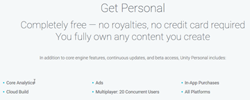
Unity Personal - Do you want to build games for the Windows platform? Get started with Unity's Personal edition which is free for beginners, students and hobbyists.

uwp-resources6

Wrap Up

Go check out some of these resources today and make the most of your time and money in 2018! Happy UWP app building!


Sunday, December 17, 2017

UWP Tip #12 - UWP Community Toolkit - Part 10, OrbitView Control

Welcome back to my UWP Community Toolkit series. The previous five tips in the series can be found here:

Intro

One of the more interesting XAML controls in the UWP Community Toolkit is the OrbitView control. The OrbitView inherits from the ItemsControl and renders its items in a layout resembling a solor system’s planets. Here is a look at the control in the UWP Community Toolkit Sample App.

Using the OrbitView Control

Since the OrbitView an ItemsCollection at its heart, any UWP developer can drop one in and get started quickly. There are several areas of focus when configuring an OrbitView.
The Control
These are some of the properties which can be set on the OrbitView to control its appearance.
  • OrbitsEnabled - Turns the visibility of the orbit lines on and off.
  • OrbitColor - Sets the color of the orbit lines.
  • OrbitThickness - Sets the thickness of the orbit lines.
  • AnchorsEnabled - Turns the visibility of the anchor lines from each item to the CenterContent on and off.
  • AnchorColor - Sets the color of the anchor lines.
  • AnchorThickness - Sets the thickness of the anchor lines.
  • IsItemClickEnabled - Controls if the items are clickable.
  • MinItemSize - The minimum size of the items in orbit.
  • MaxItemSize - The maximum size of the items in orbit.
The Items
Items can be customized by creating an ItemTemplate, DataTemplate and by setting properties on the OrbitViewDatItem itself. Create a DataTemplate for a custom look and feel of all the items. For the example in the Sample app, the DataTemplate consists of an Ellipse with a fill of a data bound image.
Here is the code for the ItemTemplate of the OrbitView in the sample app image above.

<controls:OrbitView.ItemTemplate>
    <DataTemplate>
        < controls:DropShadowPanel HorizontalContentAlignment="Stretch"
                                          VerticalContentAlignment="Stretch"
                                          BlurRadius="20"
                                          Color="Black">
            <Ellipse>
                <Ellipse.Fill>
                    <ImageBrush ImageSource="{Binding Image}" />
                </Elipse.Fill>
            </Ellipse>
        </controls:DropShadowPanel>
    </DataTemplate>
</controls:OrbitView.ItemTemplate>

Each Item can be made unique via several properties of the OrbitViewDataItem. All of these properties are available for use with data binding.
  • Image - Sets the image to be used for each specific item.
  • Distance - Indicates the distance of the item from the CenterContent.
  • Label - Sets the label on the orbit item. The DataTemplate can control the presentation of the label (caption, tooltip, etc.)
  • Diameter - Controls the relative size of the item. The diameter is a percentage based on the Min and MaxItemSize properties of the parent OrbitView control.
The CenterContent
The CenterContent contains the control to be displayed at the center of the OrbitView. Any type of control can be placed here. In the sample app, another Ellipse is that the center, but this one has a DropShadowPanel containing another Ellipse.

<controls:OrbitView.CenterContent>
    <Grid>
        <controls:DropShadowPanel>
            <Ellipse Width="105"
                  Height="105"
                  Fill="White"
                  Stroke="Black"
                  StrokeThickness="2" />
        </controls:DropShadowPanel>
        <Ellipse Width="100"
                Height="100"
                HorizontalAlignment="Center"
                VerticalAlignment="Center">
            <Ellipse.Fill>
                <ImageBrush ImageSource="ms-appx:///Assets/People/nikola.png"/>
            </Ellipse.Fill>
        </Ellipse>
    </Grid>
</controls:OrbitView.CenterContent>
The PivotItem
It is also possible to set a PivotItem to display more details about the items in the OrbitView in a new view. The Sample app shows Devices that belong to each user in orbit.

Wrap-Up

The OrbitView might not be something you use in your projects every day, but it is a really eye-popping way to represent the right data. Keep it in mind for one of your future UWP projects, and go check out the source today.

Happy coding!

Thursday, November 30, 2017

UWP Tip #11 - UWP Community Toolkit - Part 9, DockPanel Control

Welcome back to my UWP Community Toolkit series. The previous five tips in the series can be found here:

Intro

The UWP Community Toolkit v2.1.0, released November 21st, includes a new XAML control called the DockPanel.

Using the DockPanel

Like the name implies, the DockPanel control is a panel that allows children to dock to one of its sides. This docking is achieved through the DockPanel.Dock attached property. The property can be set to Top, Left, Right or Bottom. There is no Fill value to indicate filling the center of the panel.

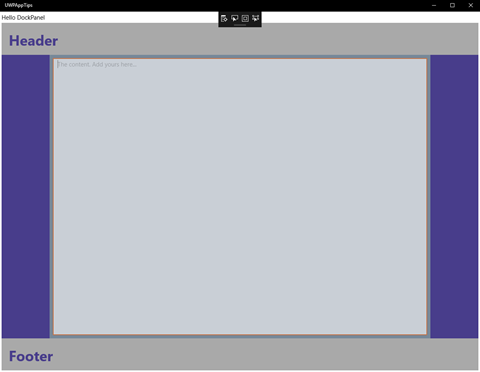
Here is the sample Window I created with a DockPanel control:

uwp_tk_dockpanel1

Each side contains a docked StackPanel. The Top and Bottom StackPanels appear first in the XAML, which is why they extend all the way to the left and right sides of the parent control instead of the left and right StackPanels extending completely to the top and bottom. I don't claim to be a UX expert, but I think the colored StackPanels help to visualize the docked areas.

To work around the lack of a Fill dock property, I tried a couple of options. When I first tried putting my TextBox as the last child of the DockPanel, it filled the middle space vertically but not horizontally. It was only about 100px wide. It could only be made wider by hard-coding the Width property. I had no luck trying different HorizontalAlignment settings on the TextBox either. I suspect there is a bug in the DockPanel causing this behavior and will be submitting an issue on GitHub.

I decided to add the TextBox as a second child in the Grid containing the DockPanel as the first child. I used the Margin property on the TextBox as a hack to make the control fit within the center of the DockPanel.

Here is the XAML source for the Window's layout:

<Grid Background="{ThemeResource ApplicationPageBackgroundThemeBrush}">
     <Grid.RowDefinitions>
         <RowDefinition Height="Auto"/>
         <RowDefinition Height="*"/>
     </Grid.RowDefinitions>
         
     <TextBlock Margin="4" Text="Hello DockPanel" VerticalAlignment="Top" HorizontalAlignment="Left"/>
         
     <Grid Padding="4,0,4,4" Grid.Row="1">
         <controls:DockPanel Background="LightSlateGray" LastChildFill="False" >
             <StackPanel Height="80" controls:DockPanel.Dock="Top" Background="DarkGray">
                 <TextBlock Text="Header" Margin="18" 
                             HorizontalAlignment="Left"  Foreground="DarkSlateBlue"
                             FontSize="36" FontWeight="Bold"/>
             </StackPanel>
             <StackPanel Height="80" controls:DockPanel.Dock="Bottom" Background="DarkGray">
                 <TextBlock Text="Footer" Margin="18" 
                             HorizontalAlignment="Left" Foreground="DarkSlateBlue"
                             FontSize="36" FontWeight="Bold"/>
             </StackPanel>
             <StackPanel Width="120" controls:DockPanel.Dock="Left" Background="DarkSlateBlue"></StackPanel>
             <StackPanel Width="120" controls:DockPanel.Dock="Right" Background="DarkSlateBlue"></StackPanel>
         </controls:DockPanel>
             
         <TextBox Margin="128,88,128,88" Opacity="0.6"
                     AcceptsReturn="True" PlaceholderText="The content. Add yours here..."/>
     </Grid>

</Grid>

Wrap-Up

It is very straightforward to use the DockPanel, outside of the quirky center area layout. Go installed the Microsoft.Toolkit.Uwp.UI.Controls NuGet package today and try it for yourself.

Happy coding!

del.icio.us Tags: ,

Monday, November 20, 2017

UWP Tip #10 - UWP Community Toolkit - Part 8, 2 Developer Tools

Welcome back to my UWP Community Toolkit series. Previous Tips in the series can be found here:

Intro

The UWP Community Toolkit contains a couple of XAML controls targeted specifically at developers and dev-focused apps. They are an AlignmentGrid and the FocusTracker. Each could be useful when developing an app UI.

AlignmentGrid XAML Control

The AlignmentGrid control can help you align other elements on a window (or within a specific container element). Let's take a look at the control running within the UWP Toolkit Sample App, outlined in Part 7 of this series.

uwp-toolkit-8.1

The control resides within the same parent Grid as the StackPanel containing the five TextBlock controls. It makes a nice way to quickly visualize your controls' layout/alignment. You can change the AlignmentGrid's Opacity and LineBrush color, depending on your preferences and your app's appearance. You can also modify the spacing of the grid lines independently with the HorizontalStep and VerticalStep properties. Here's the XAML for a simple grid containing four buttons.

<Grid Background="{ThemeResource ApplicationPageBackgroundThemeBrush}">
     <developerTools:AlignmentGrid
         x:Name="MainAlignmentGrid"
         Opacity="1"
         LineBrush="DarkGreen"
         HorizontalStep="20"
         VerticalStep="20"/>
     <StackPanel HorizontalAlignment="Center" Margin="0,40,0,0">
         <Button Content="Button 1" Margin="4"/>
         <Button Content="Button 2" Margin="4"/>
         <Button Content="Button 3" Margin="4"/>
         <Button Content="Button 4" Margin="4"/>
     </StackPanel>

</Grid>

The designer in Visual Studio 2017 shows the four buttons spaced evenly between the horizontal gridlines.

uwp-toolkit-8.2

By default the grid appears at design-time and runtime. This can be handy to check alignment at different resolutions and on different devices. When you're ready to deploy your app to the store, you can either remove the control, comment it out or add a line of code to your page's code behind to change the Visibility at runtime.

public MainPage()

{
     InitializeComponent();
     Loaded += MainPage_Loaded;

}


private void MainPage_Loaded(object sender, RoutedEventArgs e)

{
     if (!DesignMode.DesignModeEnabled)
         MainAlignmentGrid.Visibility = Visibility.Collapsed;

}

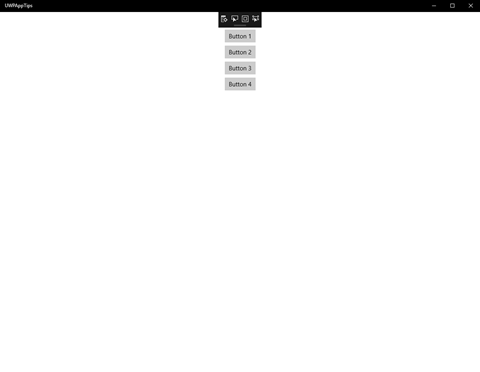
Now when we launch the app, the page appears with only the four buttons on an empty background.

uwp-toolkit-8.3


This control could also come in handy if you're developing an app that provides your users with some type of visual designer. You could additionally provide a button to toggle the visibility of the grid on/off.

FocusTracker

The FocusTracker appears as a read-only property panel displaying four properties of the currently selected XAML control on your page. The four properties displayed are:
  • Name - The name of the current XAML control, if it has one.
  • Type - The type of the current XAML control.
  • Automation.Name - If you're using UI automation and have provided the current control for this, it is displayed here (set via AutomationProperties.Name attached property).
  • Parent with Name - Traversing up the visual tree, the first parent found to have a name is displayed here, if any.
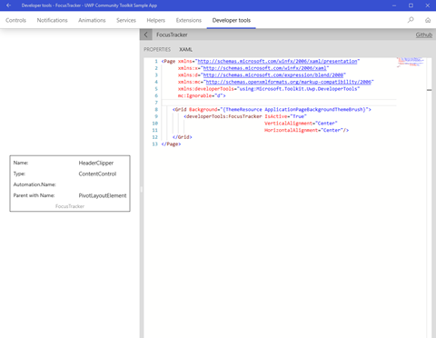
Here is the FocusTracker control running within the Sample App:

uwp-toolkit-8.4

I had clicked on the header of the code panel on the right side before taking the screen shot. Here's another shot after clicking within the code panel itself:

uwp-toolkit-8.5

You can see the FocusTracker immediately updated to display the info for the WebView hosting the XAML editor. Pretty cool!

I could see this being particularly useful to drop onto a page when you're trying to track down some issues with your automated UI tests. Give it a try if you deal with a lot of complex UI under test.

Wrap-Up

Both of these controls are definitely niche tools for a specific set of use cases, but they could both save you a ton of time if your app falls into one of those categories. Both are available in the Microsoft.Toolkit.Uwp.DeveloperTools NuGet package. Go give them a try!

Happy coding!

Tuesday, November 7, 2017

UWP Tip #9 - UWP Community Toolkit - Part 7, the Sample App

Welcome back to the UWP Community Toolkit series. Previous Tips in the UWP Community Toolkit series:
Did you know that there is a UWP Community Toolkit Sample App in the Microsoft Store?
uwptoolkitapp
The main page of the app is a dashboard with several sections:
  • Recent Activity - Shows your recent activity within the sample app.
  • What's New - Highlights new and updated features of the UWP Community Toolkit.
  • UWP Community Toolkit - General official links to aspects of the toolkit, including the GitHub repo, issues, roadmap and UserVoice.
  • Useful Links - These are links relevant to Windows app developers which aren't necessarily directly related to the toolkit. Things like the Windows Developer Center can be found here.
  • Release Notes - Release notes for recent UWP Community Toolkit releases are linked here.
  • About the App - Info and links that you would typically find on your app's About page are here on the dashboard.
Across the top, you'll find a menu bar with the categories of resources available in the Toolkit.
  • Controls
  • Notifications
  • Animations
  • Services
  • Helpers
  • Extensions
  • Developer tools
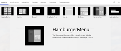
We've already covered many of these categories in this series. Clicking on controls expands a submenu with the different control types currently available in the toolkit, and hovering over one of them displays a preview of the control and its description.
uwptoolkit-controls
Let's select the HamburgerMenu and see what we can do with it in the sample app.
uwptoolkit-hamburger
Here you'll find a live preview of the control on the left side and a pane on the right with a link to the source on GitHub and three selectable panes.
  • Properties - Exposes some of the control's properties for manipulation. Make changes here and they're immediately reflected on the live preview.
  • Xaml - Displays the current Xaml source code of the page hosting the control in the live preview. Any updates you make to the Xaml source are immediately reflected in the live preview.
  • Documentation - Displays the documentation for the selected control from docs.microsoft.com.
The live preview is functional and interactive. You can interact with the menu to navigate through it's sections, displaying different images in the main panel.
The sections not related to controls, display a preview of the code output for different helper types. You can use the right panel to view both source code and docs. Take a look at the Network helper.
uwptoolkit-network
The sample app is a great way to get started exploring the UWP Community Toolkit. If you have been following along with my toolkit series and are ready to start using it yourself, I strongly encourage you to download the sample app. It will be a handy guide as you get started on your own apps leveraging the toolkit.

Happy coding!

Friday, October 27, 2017

UWP News - The UWP Community Toolkit Cheese Has Moved

Hello UWP App Dev peeps!

If you've been following along with my UWP Community Toolkit tips, you may have noticed a few of the links are either dead or redirecting to other pages. This is happening because all UWP Community Toolkit information and documentation can now be found on docs.microsoft.com. Docs is now the home for all things documentation in the Microsoft development world, in case you haven't heard. The many of the old links on developer.microsoft.com are now redirecting to Docs.

I will be going back through my blog posts over the next couple of weeks to update links. Until that time, if you encounter a dead link, feel free to leave a comment on the post or reach out to me on Twitter. You can use the excellent search feature on docs.microsoft.com to find the docs for all the UWP Toolkit features and APIs.

The code itself still lives over on GitHub. Use this site to report issues, request enhancements or contribute to the toolkit yourself through a PR. You can also contribute to the documentation on the Docs site if you find anything missing, lacking depth, or altogether incorrect.

Thanks again for following along with the UWP App Dev Tips! You can expect to see a new tip in the next couple of days.


Cheers!

Saturday, October 21, 2017

UWP Tip #8 - UWP Community Toolkit - Part 6, Using the VisualTree and LogicalTree UI Helpers

Welcome back to the UWP Community Toolkit series. Previous Tips in the UWP Community Toolkit series:
Introduction
This tip will continue exploring the Code Helpers that we started looking at in Part 3. There are only a few types of helpers remaining, and today we will examine the collection of available VisualTree and LogicalTree UI extension methods.
VisualTree Extensions
The VisualTree extension methods extend and simplify the built-in UI element navigation methods of the framework. There are currently five methods available to use in the toolkit.
  • FindDescendantByName(elementName) - Navigates down the visual tree until an element with the provided name is found.
  • FindDescendant<T>() - Navigates down the visual tree and returns the first element for the given type.
  • FindDescendants<T>() - Returns an IEnumerable of all descendant elements of the given type.
  • FindAscendantByName(elementName) - Navigates up the visual tree until an element with the provided name is found.
  • FindAscendant<T>() - Navigates up the visual tree and returns the first element for the given type.
Here is an example of the use of each method to retrieve UI elements from your visual tree.
public void ProcessVisualUiElements()
{
    var listControl = mainGrid.FindDescendantByName("resultList");
    listControl = mainGrid.FindDescendant<ListView>();
    listControl.MaxWidth = 500;
    foreach (var item in mainGrid.FindDescendants<ListViewItem>())
    {
        item.IsEnabled = false;
    }
    var gridControl = resultList.FindAscendantByName("mainGrid");
    gridControl = resultList.FindAscendant<Grid>();
    gridControl.Margin = new Thickness() { Bottom = 2, Left = 2, Right = 2, Top = 4 };
}

Most UWP developers will probably use the FindAscendant/FindDescendant methods using the type of element to find as we try to avoid naming our UI elements.
LogicalTree Extensions
The LogicalTree extensions are very similar but they operate over logical elements, ignoring certain containers and style elements only found in the visual tree. Not having to rely on knowing if the elements have been rendered yet before finding them can be an advantage of this method also.
The set of methods available mirror those for the visual tree with one additional method to find an element's content control.
  • FindChildByName(elementName)
  • FindChild<T>()
  • FindChildren<T>()
  • FindParentByName(elementName)
  • FindParent<T>()
  • GetContentControl()
The sample code also mirrors the previous sample.
public void ProcessLogicalUiElements()
{
    var listControl = mainGrid.FindChildByName("resultList");
   
    listControl = mainGrid.FindChild<ListView>();
   
    foreach (var item in resultList.FindChildren<ListViewItem>())
    {
        item.IsEnabled = true;
    }
   
    var gridControl = resultList.FindParentByName("mainGrid");
   
    gridControl = resultList.FindParent<Grid>();
   
    var searchContent = searchTextBox.GetContentControl();
}

Wrap-Up
That's all for today's helpers! They're very straightforward to use and can save quite a bit of manually traversing the visual and logical trees to find a target element. Check back as next time we will finish up the helpers provided by the UWP Community Toolkit.
Happy coding!

del.icio.us Tags: ,,


Friday, September 29, 2017

UWP Tip #7 - UWP Community Toolkit - Part 5, Using the Streams Code Helper

Welcome back to the UWP Community Toolkit series. Previous Tips in the UWP Community Toolkit series:

Introduction

This tip will continue exploring the Code Helpers that we started looking at in Part 3. There are three types of helpers remaining, and today we will examine the StreamHelper class.

Purpose

The StreamHelper class contains methods to read files from a stream via local files or via a network stream. There is also a helper method to read data from an http source and write it directly to a local file. There are also some helper methods to check if files and folders exist for a given name and path.

Let's look at a few of the method signatures:

  • GetHttpStreamAsync(System.Uri uri) - Gets a stream from an HTTP request.
  • IsLocalFileExistsAsync(System.String fileName) - Checks if a local files exists in the application's folder.
  • IsLocalCacheFileExistsAsync(System.String fileName) - Checks if a local file exists in the cache folder.
  • ReadTextAsync(Windows.Storage.Streams.IRandomAccessStream stream,System.Text.Encoding encoding) - Takes a stream and reads it to a returned string.

Example

In this short example, we are going to create a StreamService for our project that implements an IStreamService interface for testability. Although the lack of an interface for the toolkit's StreamHelper makes it a little tricky to mock this for our tests. We'll leave this for another day or perhaps an issue to be filed on their GitHub.

The StreamService has two methods, one for getting a string back from and HTTP call and another to get one from reading a file in the local cache.

public class StreamService : IStreamService
{
    public async Task<string> GetStringFromUrlAsync(Uri source)
    {
        using (var stream = await StreamHelper.GetHttpStreamAsync(source))
        {
            return await stream.ReadTextAsync();
        }
    }
     public async Task<string> GetStringFromLocalCacheAsync(string fileName)
    {
        using (var stream = await StreamHelper.GetLocalCacheFileStreamAsync(fileName, Windows.Storage.FileAccessMode.Read))
        {
            return await stream.ReadTextAsync();
         }
    }
}

Everything is wrapped up with only strings and a Uri in and out, keeping the external dependency out of our ViewModels. To check out all of the available helper methods in the StreamHelper class, you can visit the API documentation here.

Wrap-Up

Only two helper types to go. Next time we will continue with the VisualTreeExtensions code helper in the UWP Community Toolkit.

Happy coding!


del.icio.us Tags: ,

Friday, September 22, 2017

UWP Tip #6 - UWP Community Toolkit - Part 4, Leveraging the StorageFiles and Storage Code Helpers

Welcome back to the UWP Community Toolkit series. You'll have to excuse the delay between posts as TechBash 2017 has been monopolizing my free time this month.

Previous Tips in the UWP Community Toolkit series:

Introduction

This tip will continue exploring the Code Helpers that we started looking at in Part 3. There are five types of helpers remaining, and today we'll look at the StorageFileHelper and Storage helpers.

StorageFiles

The StorageFileHelper utility class has helper methods for reading from and writing to disk. There are method overloads to read and write both text and binary data to a file either directly to the local storage folder or to given folderId and/or folderName. Some overloads for writing take a CreationCollisionOptions parameter to decide how to handle conflicts during file or folder creation. All StorageFile operations are async.

Here is a simple example of simple read and write service methods that wrap calls to the StorageFileHelper methods that use the user's local storage.

 public async Task WriteUserData(string data, string fileName)
{
    await StorageFileHelper.WriteTextToLocalFileAsync(data, fileName);
}

public async Task<string> ReadUserData(string fileName)
{
    return await StorageFileHelper.ReadTextFromLocalFileAsync(fileName);
}

Storage

The StorageService, not to be confused with the previous StorageFileHelper, is for reading and writing objects within your application. The objects can be read and written locally or you can choose to roam the data across all the user's devices. This selection is made by using either a LocalObjectStorageHelper or a RoamingObjectStorageHelper. Makes sense.

Let's say you had a health care application of some kind and you wanted to save an object containing the currently selected clinic's information.

 public class Clinic : IClinic
{
    public string Name { get; set; }
    public string Location { get; set; }
    public int NumberOfBeds { get; set; }
    public ClinicType Type { get; set; }
}

We want to take this and persist it for the current device. So, we'll create some service methods to read and write the object local to the current device.

    public class StorageService
    {
        private LocalObjectStorageHelper _localStorageHelper = new LocalObjectStorageHelper();

        public async Task SaveClinic(IClinic clinic, string key)
        {
            await _localStorageHelper.SaveFileAsync(key, clinic);
        }

        public async Task<IClinic> ReadClinic(string key)
        {
            return await _localStorageHelper.ReadFileAsync<IClinic>(key);
        }
    }

That's it. We've wrapped the methods to read and write and only need to deal with our own interfaces in and out. If you wrap this service class in an interface and inject the helper itself, it will be nicely abstracted for testability. You can use these service methods from any of the existing ViewModels in your UWP app.

Wrap-Up

Next time we will continue with the Code Helpers in the UWP Community Toolkit. The Streams helper is up next.

Happy coding!

Wednesday, August 30, 2017

UWP News - UWP Community Toolkit 2.0 has been released

This is just a quick break from the UWP Tips to let you know that the UWP Community Toolkit 2.0 has been released by Microsoft. There are a bunch of changes for developers and designers, including enhancements to support the Fluent Design System coming in the Windows 10 Fall Creators Update.

Go check out this post on the Windows blog for all the details.

Today, the UWP Community Toolkit graduates to version 2.0 and sets the stage for future releases.
There have been seven releases since the UWP Community Toolkit was first introduced exactly one year ago and version 2.0 is the first major and largest update to date. The developer community has worked enthusiastically to build something that is used by thousands of developers every month. Today, there are over 100 contributors, and developers have downloaded the packages over 250,000 times. This would not be possible without the strength of the community – Thank You!

If you want to skip the announcement and get coding, you can grab the latest on NuGet or check it out on GitHub.

Happy coding!

Thursday, August 24, 2017

UWP Tip #5 - UWP Community Toolkit - Part 3, Leveraging Code Helpers (Color, Connection, Converters and ImageCache)

Previous Tips in the UWP Community Toolkit series:

Introduction

In part 3 in this mini-series on the UWP Community Toolkit, we will get an overview of four of the available groups of Code Helpers in the toolkit.

Colors

The Colors helper methods provide a few simple conversions when working with colors in your UWP app.

ToColor() - Take a string, which can be an HTML color, Alpha code or string representation of a Windows.UI.Color, and it returns a Windows.UI.Color.

ToHex() - Takes a Windows.UI.Color and returns the hexadecimal value of that color (string).

ToInt() - Takes a Windows.UI.Color and returns an ARGB structure as an integer.

ToHsl() - Takes a Windows.UI.Color and returns an HslColor.

ToHsv() - Takes a Windows.UI.Color and returns an HsvColor object.

FromHsl() and FromHsv() - Just the opposite of the last two helper methods.

Connection

The ConnectionHelper currently expose two (self-explanatory) Boolean properties;

  • IsInternetOnMeteredConnection
  • IsInternetAvailable

Converters

The toolkit provides four Converters in the current version of the NuGet package.

BoolToVisibiltyConverter - I think we have all written this one a few times before, or perhaps leveraged one from another UWP or WPF library. It converts a Boolean property from your DataContext to a Visibility enum value.

CollectionVisibilityConverter - This converter will return Visible if a collection is null or empty. This can be useful to display a message when no results are available for a list.

StringFormatConverter - Converts an object to a string and takes an option parameter to use when the converter calls string.Format(object, optionalParameter).

StringVisibilityConverter - Similar to the CollectionVisibilityConverter, this converter returns Visible if a string is null or string.Empty.

ImageCache

The ImageCache will help you store images in a cache in temporary local storage in an async manner. Available methods and properties include:

InitializeAsync() - Sets up the cache with a folder location and a name for the cache folder.

ClearAsync() - Clears the cache. An overload is also provided to clear cache contents based on a TimeSpan.

PreCacheAsync() - Pre-caches a supplied image from the online Uri.

GetFromCacheAsync() - Fetches an image from the cache. If the image is no longer in the cache (or never was), it will be fetched from the supplied Uri.

CacheDuration - Sets the duration (TimeSpan) to store images in the cache.

MaxMemoryCacheCount - The maximum number of images to store in the cache instance.

Wrap-Up

There are dozens of great helper methods and properties available in the UWP Community Toolkit. We're just getting started with the review of what's available. Next time, we'll examine the rest of the helper categories. Go check them all out and add the NuGet package to your UWP project today!

Happy coding!


del.icio.us Tags: ,

Sunday, July 9, 2017

UWP Tip #2 - Windows Template Studio - Examining the Project

Introduction

In Tip #1, I created a new UWP project with a template from Windows Template Studio v1.1. The app is a Navigation Pane style project that uses MVVMLight and contains Web Views to display three different websites.

Let's take a look at a few aspects of the generated project.

NuGet Packages

Besides the basic UWP NuGet package, three other packages were added to my project when it was created.

Views

Views were created for the application's shell, the main page which is generated without any content, and my three Web Views.
  • ShellPage.xaml
  • MainPage.xaml
  • MorningDewPage.xaml
  • UWPTipsPage.xaml
  • WPFTipsPage.xaml
The ShellPage contains the Hamburger menu & Navigation Tree on the left side and the content panel on the right side to host each of other views in the project.

Each web view contains some style code for in the Page.Resources for styling the browser buttons. If you have multiple web views, this XAML could be centralized and reused across your pages. There is also some code for handling the loading behaviors, visibility, and the WebView (Windows.UI.Xaml.Controls.WebView) itself.

The MainPage is essentially empty with the exception of some Xaml to handle the VisualStates. I added a couple of TextBlocks with a welcome message and some information about navigating to the other pages.

ViewModels

There are ViewModels corresponding to each view listed above. There is another for ShellNavigationItem. This facilitates handling multiple pages in the navigation app without hard-coding them in the Shell's view somewhere. There is also a ViewModelLocator class, which will be familiar to anyone who has used MVVMLight. This answer on StackOverflow does a great job of explaining its purpose.

The ShellViewModel uses the ShellNavigationItem and a NavigationServiceEx to switch between the views of its main content panel.
private void Navigate(object item)
{
    var navigationItem = item as ShellNavigationItem;
    if (navigationItem != null)
    {
        NavigationService.Navigate(navigationItem.ViewModelName);
    }
}
Most of the code in the ViewModels for each web view is dedicated to handling. I would recommend refactoring most of this code out to a common base class if you are going to be working with more than one or two web views in a project. Much of the logic is centered around handling navigation between websites and web pages within the WebView control: browsing forward/back, retry, refresh, etc.

Services and Helpers

There are two service classes in the project, ActivationService and NavigationServiceEx. Let's start with the NavigationServiceEx used by the Shell. Here's the class diagram of this service.


It contains all you need to browse between your child views, including browser-style back/forward functionality.

The ActivationService encapsulates our app's activation behavior and its back stack in Windows, working with the NavigationServiceEx for this.


Wrap-Up

The project I generated with Windows Template Studio, created a great starting point for application that can be used to navigate a few different websites. If you create something similar, I would recommend some refactoring to reduce code duplication between Views and ViewModels of the same type. This will lead to much greater maintainability moving forward. Otherwise, it's a really solid way to get started on your next project.

Happy coding!