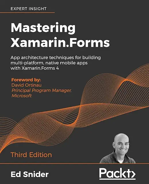
Go check out my full review of the book on my Morning Dew blog.
Happy Coding!

<Grid>
         <controls:TabView>
             <controls:TabView.Header>
                 <TextBlock Text="Top of the World!"/>
             </controls:TabView.Header>
             <controls:TabViewItem Header="First Tab">
                 <TextBlock Text="First tab Contents!"/>
             </controls:TabViewItem>
             <controls:TabViewItem Header="Tab 2">
                 <TextBlock Text="Tab 2 contents!"/>
             </controls:TabViewItem>
             <controls:TabViewItem Header="3rd Tab">
                 <TextBlock Text="3rd tab contents!"/>
             </controls:TabViewItem>
             <controls:TabViewItem Header="Last Tab">
                 <TextBlock Text="Last tab contents!"/>
             </controls:TabViewItem>
             <controls:TabView.Footer>
                 <TextBlock Text="The End"/>
             </controls:TabView.Footer>
         </controls:TabView>
</Grid>

<controls:TabView.TabEndHeader>
   <Button Width="48"
     Height="40"
      Margin="-1,0,0,0"
      BorderThickness="1"
       Background="Transparent"
       Style="{StaticResource ButtonRevealStyle}">
     <Viewbox MaxWidth="16" MaxHeight="16">
       <SymbolIcon Symbol="Setting"/>
     </Viewbox>
   </Button>
</controls:TabView.TabEndHeader>


<StackPanel Padding="40" DataContext="{Binding}">
     <TextBlock Margin="8">
         <Run FontSize="24" Foreground="#FFFC5185">Get Started with XAML Studio on UWP Tips</Run><LineBreak/>
         <Run>Check out the live preview.</Run>
     </TextBlock>
    <Button Content="I Do Nothing" Margin="8"/>

    <ListView ItemsSource="{Binding}">
         <ListView.ItemTemplate>
             <DataTemplate>
                 <StackPanel Orientation="Horizontal">
                     <TextBlock Text="{Binding Path=id}" Margin="4"/>
                     <TextBlock Text="{Binding Path=type}" Margin="4"/>
                     <TextBlock Text="{Binding Path=name}" Margin="4"/>
                     <TextBlock Text="{Binding Path=rating}" Margin="4"/>
                 </StackPanel>
             </DataTemplate>
         </ListView.ItemTemplate>
     </ListView>
</StackPanel>

I typically leave the link blogging over on the Morning Dew, but I thought my readers here might appreciate a post with a rundown of useful resources for Windows developers.
We'll start off with some GitHub repos that I have starred. The organizations behind each repo are listed in parentheses.
Windows UI Library (Microsoft) - These are the Microsoft UWP XAML controls/styles/materials created for backward compatibility across Windows 10 versions back to the Anniversary Update. As new features are added, you can immediately make them available to your apps across all of these versions of Windows.
Windows Community Toolkit (Windows Community Toolkit) - If you follow my blog, you're very familiar with this toolkit. Formerly known as the UWP Community Toolkit, it now provides a phenomenal set of controls, helpers and services for all Windows developers.
Windows Template Studio (Microsoft) - I've also blogged about this extension on several occasions. WTS provides templates for Visual Studio and a wizard to bootstrap your UWP app with a great foundation built on popular tools and good patterns & practices.
Rapid XAML Toolkit (Microsoft) - This toolkit is a newer community effort spearheaded by Matt Lacey. It is still in preview and aims to accelerate app development for all XAML developers - UWP, WPF, and Xamarin.Forms. I blogged about the toolkit a couple of weeks ago if you would like to learn more.
Fluent XAML Theme Editor (Microsoft) - This is the source code for the Fluent XAML Theme Editor app, now available in the Windows Store. Build your own Fluent theme with light and dark support and use it in your own apps. The app requires Windows SDK version 17763 or higher.
Prism (Prism Library) - Prism is the ultimate framework for XAML developers, with support for WPF, UWP, and Xamarin.Forms. Make your apps more maintainable and testable with simple and robust MVVM, DI, commands and other patterns & tools.
MVVM Light Toolkit (Laurent Bugnion) - MVVM Light offers an alternative to the MVVM framework provided in Prism. It supports UWP, WPF and Xamarin Forms/iOS/Android. This was the first MVVM library I used and it's still a favorite when putting together sample apps.
A good framework or toolkit needs great documentation, right? Get the docs here, or contribute to them with your own expertise!
Universal Windows Platform Docs - The Microsoft Docs landing page for all UWP documentation. There are resources to get started, design, develop and publish your apps, as well as a full API reference.
Windows Community Toolkit Docs - The Microsoft Docs home for Windows Community Toolkit docs. Get help with controls or helpers in the toolkit, use get a reference for APIs or contribute to the docs yourself.
Prism Documentation - The official docs for the Prism Library. There are some general guides and sections specific to WPF and Xamarin.Forms.
MVVM Light Documentation - The MVVM Light docs have some samples, walkthroughs, and a link to a fundamentals course on Pluralsight.
Keep up with the latest news.
Windows Developer Blog - The official Microsoft blog for the Windows Dev team. Subscribe for updates on SDKs, toolkits, Windows 10 releases and more.
Windows 10 Blog - This blog is the place to get announcements of new Windows features, upcoming events, and releases of new Windows 10 builds (final and Insiders).
The Visual Studio Blog - If you're a Windows developer, there's a pretty good chance you use Visual Studio. Keep up with the latest VS news here.
XAML Brewer - Diederik Krols has some great UWP tutorials on his blog, most recently about improving accessibility in a control.
Windows Dev Center - The Microsoft hub for Windows developers. This site has links to all the resources Windows developers need today. Get to docs, tools, SDKs, events, design resources, and register to sell your apps on the Store through the Partner Center dashboard.
Visual Studio App Center - Sign up for the App Center can get continuous integration against your app's repo, test it on actual devices with automation, and deploy to beta testers and production users. You can also get crash reports and analytics with a few API hooks in your app.
Microsoft Design - Get information about the Fluent Design System and start designing and developing your apps with Fluent Design.
Windows Community Toolkit Sample App - Get the sample app to demo the components inside the Windows Community Toolkit.
Visual Studio Marketplace - Windows Template Studio - Download and install WTS from the VS Marketplace. Love the tool? Leave a review!
Prism LIbrary - Prism's home page. It's got links to their docs, learning resources and their Slack channel.
MVVM Light Toolkit - The MVVM Light homepage.
Stack Overflow - Questions tagged "uwp" on Stack Overflow.
@windowsdev - Follow the Windows Developer team on Twitter.
#ifdef WINDOWS - Join Nikola Metulev, Sr. Program Manager for Windows Dev, for a regular video series on Channel 9 where he interviews engineers on the Windows platform.
That's all I have for this first edition. If you have suggestions for future posts, please leave a comment or ping me on Twitter. I plan on posting these semi-annually, but if I get enough suggestions, I may have to create a second edition sooner. Thanks!
Note: The Rapid XAML Toolkit isn't UWP-specific. You can leverage these tools for WPF and Xamarin.Forms development. XAML developers, check it out today!
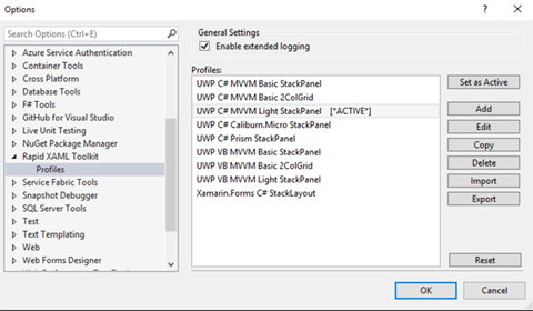
These tools aim to reduce the time and effort required to get the basics working and allow you to customize the UI to meet your preferences or the specific needs of your app. We can't and don't try to create the whole app for you but we can make creating and working with XAML faster easier.In short, the toolkit can take a set of properties from a ViewModel in your project and generate XAML controls in your corresponding View.



public string PatientName { get; private set; }

public int SSN { get; set; }

public DateTimeOffset VisitDate { get; set; }

public string VisitNotes { get; set; }

public decimal CurrentWeight { get; }

public ObservableCollection<Medication> Prescriptions { get; set; }
public class Medication
{
     public int Id { get; set; }
     public string Name { get; set; }
     public string UnitOfMeasure { get; set; }
     public double Strength { get; set; }
}
You will have this XAML markup pasted:<TextBlock Text="{Binding PatientName}" />
<Slider Minimum="0" Maximum="100" x:Name="SSN" Value="{Binding SSN, Mode=TwoWay}" />
<DatePicker Date="{Binding VisitDate, Mode=TwoWay}" />
<TextBox Text="{Binding VisitNotes, Mode=TwoWay}" />
<TextBlock Text="{Binding CurrentWeight}" />
<ListView ItemsSource="{Binding Prescriptions}">
<ListView.ItemTemplate>
<DataTemplate x:DataType="model:Medication">
<StackPanel>
<TextBlock Text="{x:Bind Id, Mode=OneWay}" />
<TextBlock Text="{x:Bind Name, Mode=OneWay}" />
<TextBlock Text="{x:Bind UnitOfMeasure, Mode=OneWay}" />
<TextBlock Text="{x:Bind Strength, Mode=OneWay}" />
</StackPanel>
</DataTemplate>
</ListView.ItemTemplate>
</ListView>
I'll grant that it doesn't create the prettiest UI, but it is still an early beta and very little editing is required from this point to create something usable. Here is what the generated view looks like to a user: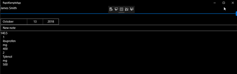
Welcome back to another UWP Tip focusing on the Windows Community Toolkit.
The Windows Community Toolkit contains a growing collection of services that provide easy access to services from Microsoft and other sources. These are the services available to developers in version 4.0 of the toolkit.
This post will illustrate how to use the Bing and Microsoft Translator services with some simple examples. The examples wrap the two services in our own application service class which could be used by a UWP app or other Windows application.
To use the Translator service, an application key for the service is necessary. Developers can register for a key here.
The TranslateTextAsync async method will take three parameters:
The source and destination languages are passed to the translate method in the form of 'friendly names' of each language. To the the entire list of these names, use the service method TranslatorService.Instance.GetLanguageNamesAsync(). Another option is to attempt detection of the source language with the method TranslatorService.Instance.DetectLanguageAsync(string).
Here is the complete code for our method.
private const string MyTranslatorKey = "<your key here>";

public async Task<string> TranslateTextAsync(string sourceLanguage, string destinationLanguage, string sourceText)
{
     await TranslatorService.Instance.InitializeAsync(MyTranslatorKey);
     // Translates the source text to from the specified source language to the destination language.
     return await TranslatorService.Instance.TranslateAsync(sourceText, sourceLanguage, destinationLanguage);
}
NOTE: The Bing service has been marked as obsolete as of Windows Community Toolkit 4.0. The team recommends using the Cognitive Services SDK moving forward. That SDK can be found here on GitHub.
The Bing API requires an API key, which can be obtained here. There is a free trial account available. Sign up, select the free options, and get access to up to 5000 queries per month from your applications. Our SearchAsync(string, int) method will create a searchConfig object which will tell the service to search from the U.S. using English language and perform a standard search. A News search type is also available. The method will then perform the search and return the number of BingResult record types specified by the numberofResults parameter.
public async Task<List<BingResult>> SearchAsync(string searchText, int numberOfResults)
{
     if (string.IsNullOrWhiteSpace(searchText))
     {
         return null;
     }
     var searchConfig = new BingSearchConfig
     {
         Country = BingCountry.UnitedStates,
         Language = BingLanguage.English,
         Query = searchText,
         QueryType = BingQueryType.Search
    };
     return await BingService.Instance.RequestAsync(searchConfig, numberOfResults);
}
Easy-peasy, right? After the next major release of the Windows Community Toolkit, we will examine how to perform the same types of queries with the Cognitive Services SDK.
These are a couple of easy-to-consume services that developers can use today in their applications by simply adding the required Windows Community Toolkit NuGet packages. To check out the complete docs for the available services, visit Microsoft Docs.
Happy coding!


<StackPanel Orientation="Horizontal" Margin="12">
<TextBlock Text="DataGrid Sample : Mountains" VerticalAlignment="Center" Margin="5,0" Style="{ThemeResource SubtitleTextBlockStyle}"></TextBlock>
<AppBarButton Icon="Filter" Label="Filter by">
<AppBarButton.Flyout>
<MenuFlyout>
<MenuFlyoutItem x:Name="rankLow" Text="Rank < 50" />
<MenuFlyoutItem x:Name="rankHigh" Text="Rank > 50" />
<MenuFlyoutSeparator />
<MenuFlyoutItem x:Name="heightLow" Text="Height < 8000ft" />
<MenuFlyoutItem x:Name="heightHigh" Text="Height > 8000ft" />
</MenuFlyout>
</AppBarButton.Flyout>
</AppBarButton>
<AppBarButton x:Name="groupButton" Icon="List" Label="Group by" />
</StackPanel>
The code for the DataGrid primarily consists of a number or properties and then a DataGridTextColumn for each column added to the control. Here's that code:<controls:DataGrid
Grid.Row="1"
x:Name="dataGrid"
Margin="12"
VerticalAlignment="Stretch" HorizontalAlignment="Stretch"
HorizontalScrollBarVisibility="Visible"
VerticalScrollBarVisibility="Visible"
AlternatingRowBackground="Transparent"
AlternatingRowForeground="Gray"
AreRowDetailsFrozen="False"
AreRowGroupHeadersFrozen="True"
AutoGenerateColumns="False"
CanUserSortColumns="False"
CanUserReorderColumns="True"
CanUserResizeColumns="True"
ColumnHeaderHeight="32"
MaxColumnWidth="400"
FrozenColumnCount="0"
GridLinesVisibility="None"
HeadersVisibility="Column"
IsReadOnly="False"
RowDetailsTemplate="{StaticResource RowDetailsTemplate}"
RowDetailsVisibilityMode="Collapsed"
SelectionMode="Extended"
RowGroupHeaderPropertyNameAlternative="Range">
<controls:DataGrid.Columns>
<controls:DataGridTextColumn Header="Rank" Binding="{Binding Rank}" Tag="Rank" />
<controls:DataGridTextColumn Header="Mountain" Binding="{Binding Mountain}" Tag="Mountain" />
<controls:DataGridTextColumn Header="Height (m)" Binding="{Binding Height_m}" Tag="Height_m" />
<controls:DataGridTextColumn Header="Range" Binding="{Binding Range}" Tag="Range" />
<controls:DataGridTextColumn Header="Parent Mountain" Binding="{Binding Parent_mountain}" Tag="Parent_mountain" />
</controls:DataGrid.Columns>
</controls:DataGrid>
For the purposes of a sample app, everything but the grid data is hard coded. Your app could certainly bind any of these properties that you would like to either load from saved configuration or user preferences.<DataTemplate x:Key="RowDetailsTemplate">
<StackPanel>
<TextBlock Margin="20" Text="Here are the details for the selected mountain:" />
<Grid Margin="20,10" Padding="5">
<Grid.RowDefinitions>
<RowDefinition Height="Auto" />
<RowDefinition Height="Auto" />
<RowDefinition Height="Auto" />
<RowDefinition Height="*" />
</Grid.RowDefinitions>
<Grid.ColumnDefinitions>
<ColumnDefinition Width="Auto" />
<ColumnDefinition Width="Auto" />
</Grid.ColumnDefinitions>
<TextBlock Text="Coordinates: " FontWeight="SemiBold" FontSize="13" />
<TextBlock Grid.Row="1" Text="Prominence (m): " FontWeight="SemiBold" FontSize="13" />
<TextBlock Grid.Row="2" Text="First Ascent (year): " FontWeight="SemiBold" FontSize="13" />
<TextBlock Grid.Row="3" Text="No. of ascents: " FontWeight="SemiBold" FontSize="13" />
<TextBlock Grid.Column="1" FontSize="13" Text="{Binding Coordinates}" HorizontalAlignment="Right" />
<TextBlock Grid.Row="1" Grid.Column="1" FontSize="13" Text="{Binding Prominence}" HorizontalAlignment="Right" />
<TextBlock Grid.Row="2" Grid.Column="1" FontSize="13" Text="{Binding First_ascent}" HorizontalAlignment="Right" />
<TextBlock Grid.Row="3" Grid.Column="1" FontSize="13" Text="{Binding Ascents}" HorizontalAlignment="Right" />
</Grid>
</StackPanel>
</DataTemplate>
If a user were to view details on a row, this is how the information would be displayed. The sample app does not appear to currently implement a way to display the RowDetailsTemplate in the UI.Big news for Windows developers this week!
On Monday, the Windows Developer team announced the preview release of the Windows UI Library. Windows UI Library, or WinUI, is a set of NuGet packages which contain UWP XAML controls and other features which can be used across different versions of Windows 10. Many of these will be compatible with release from 1607 to the latest Insiders Fast Ring builds.
Windows developers will no longer need to wait for their users to adopt the latest Windows 10 release in order to provide some of the rich features provided by these packages, like Fluent controls.
WinUI preview currently consists of two NuGet packages:
Want to get started with WinUI? Here's a quick step-by-step guide to creating a project, adding the NuGet packages, and adding a couple of the new XAML controls to your main Window. Want to add WinUI to an existing UWP project? As long as your project's Minimum version is at least 14393 and Target version is 17134 or later, you can follow the same steps to add the NuGet packages.
First, create your project in Visual Studio 2017 (VS 2015 is not supported).
Next, open the NuGet package management window for your project. Select Browse, and search for Microsoft.UI.Xaml. Be sure to select the "Include prerelease" checkbox next to the search field or you will see no results.
Add the packages you want to use. After adding Microsoft.UI.Xaml, a readme file will open advising you to add the following snippet to your project's App.xaml. Be sure you do this immediately after installing the package.
<Application.Resources>
     <XamlControlsResources xmlns="using:Microsoft.UI.Xaml.Controls"/>
</Application.Resources>
Now you can close your NuGet Package Manager and the readme.txt and App.xaml files. Let's add a couple of new and updated controls to MainPage.xaml. Start by adding a reference to your Page:
xmlns:winUiControls="using:Microsoft.UI.Xaml.Controls"
I've added a few controls to my Page, a TwoPaneView containing a SplitButton in Pane1 and a PersonPicture in Pane2.
<winUiControls:TwoPaneView>
     <winUiControls:TwoPaneView.Pane1>
         <Grid>
             <winUiControls:SplitButton Content="Click or Select" Margin="12"/>
         </Grid>
     </winUiControls:TwoPaneView.Pane1>
     <winUiControls:TwoPaneView.Pane2>
         <Grid>
             <winUiControls:PersonPicture/>
         </Grid>
     </winUiControls:TwoPaneView.Pane2>
</winUiControls:TwoPaneView>
The result is exactly what you would expect for this snippet.
So, what controls are included in the Microsoft.UI.Xaml package? If you open Object Browser, you will currently find a huge list classes under the Microsoft.UI.Xaml.Controls namespace. A few of the new and updated controls include:
Lots to love for sure. Documentation of the classes in this namespace can be found here, although much of it is currently limited and only labeled as prerelease.
Ready to play? Go check out the Getting Started article on MS Docs and the XAML Controls Gallery code on GitHub! Remember this is currently prerelease code and may undergo some change before it goes RTM.
Happy coding!
Windows Template Studio 2.2 was released about two weeks ago. You can view the full list of new features, enhancements and bug fixes on the GitHub repo here. These are a few of the highlights.
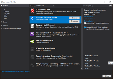
You can install the latest version of Windows Template Studio from the Visual Studio Marketplace or in Visual Studio's extension manager.
Let's walk through the new project creation process with Windows Template Studio in Visual Studio 2017. Start with File-->New Project.
Select the Windows Template Studio (Universal Windows) project type, give your project a name and click OK. Next you'll start with the project wizard.
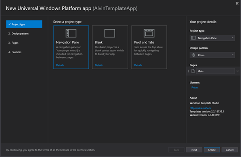
Start the wizard by choosing your project type.
I'm going to select the Navigation Pane type, which gives you a familiar left navigation area with a hamburger menu. Select Next to move on to Design Pattern.
Choose your project's design pattern/package.
I usually choose MVVM Light for my sample applications and other simple projects. Today I am going to select Prism to see what is generated by Windows Template Studio for this pattern.
Click Next to move on to selecting what types of pages to include in your application.
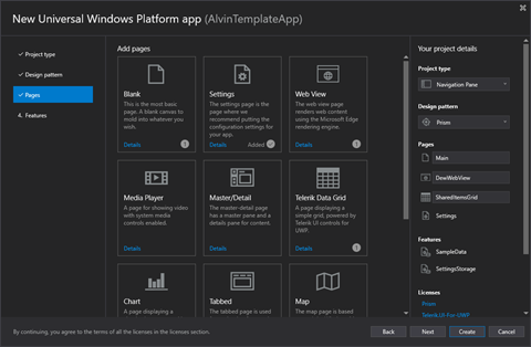
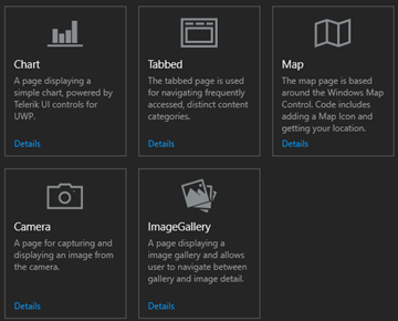
There are eleven types of pages from which to choose. Select the ones to be included in your project.
In addition to the default Main page selected, I've chosen to add a Web View named DewWebViewPage, a Settings page, and a Telerik Grid Page named SharedItemsGridPage.
Click Next again and we'll finish up by selecting some optional features to add to the app.
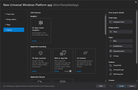
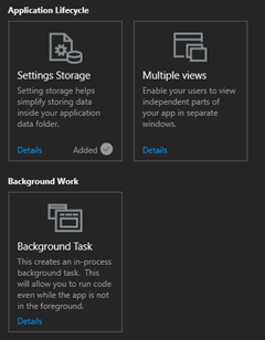
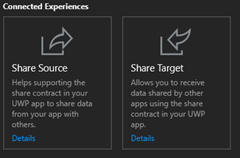
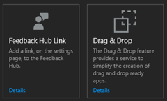
Version 2.2 now has 17 features to select for your app. Pick the ones that best suit your application's needs and feature set and click Finish to generate your project.
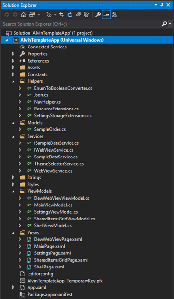
Now that the project has been created, you should see the default UWP welcome screen with some helpful links and your Solution Explorer. I'm going to start by taking a look at what NuGet packages were added for my project.
Based on my wizard selections, I have a handful of packages referenced by my project, including those for Prism.Unity and Telerik.UI.UWP. Your result will vary based on the pattern, pages and features selected for your project.
Next, let's expand a few of the project folders to examine the files created for the project.
You should see a View and corresponding ViewModel for each of the Pages you selected for your app, assuming you did not select the Code Behind pattern. In that case, there will be no ViewModel classes.
The Services and Helpers will also vary from those above based on your feature selections.
In my case, there is a SampleOrder in the Models folder for use with the Data Grid. This will be changed to mirror the actual model to be used in the application's grid. The SampleDataService and its corresponding interface will be used to populate the grid. The WebView also has a service and a service interface for testability.
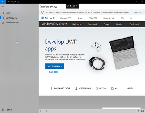
Run the app and try it out. All of the base navigation functionality is there and works great.
The Main Page
The WebView
The Data Grid
The Settings… let's change to the Dark Theme while we're in here.
That's it for the basics. Stay tuned for the next part where we will examine some of the code files and make some tweaks to make it fit your application's requirements.
Happy coding!
Welcome back to my Windows Community Toolkit series, formerly known as the UWP Community Toolkit series (see this post). The previous five tips in the series can be found here:
The Windows Community Toolkit v3 was a major update for the toolkit. In addition to adding and enhancing many of the extensions, animations, helpers and services, it has added several new controls.
I will examine these new controls over the next several tips in the series. We will circle back to some of the other types of features in the toolkit later. Today, let's start with the InfiniteCanvas.
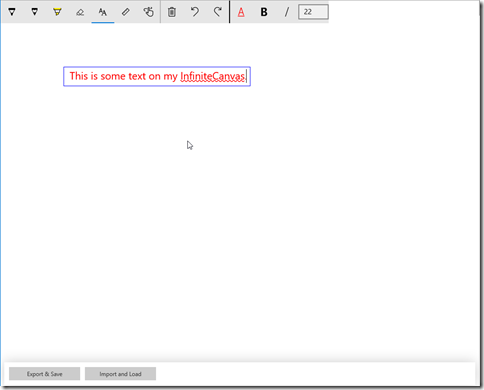
The new InfiniteCanvas control for UWP applications is a rich, polished and powerful control. Out of the box it supports inking, text entry & formatting, zooming, undo/redo and of course infinite scrolling (hence the name). You can also import and export the InfiniteCanvas contents as json.
Take a look at the InfiniteCanvas running in the latest version of the Windows Community Toolkit Sample App.
Notice that, like other text input controls in UWP apps, the text input in InfiniteCanvas supports spell checking. The toolbar on the control can be toggled on and off with the IsToolbarVisible property. You might want to bind that property so that it is only True when a particular part of your app has focus. Dropping the control into a Grid with the default functionality and a visible toolbar is as simple as:
<Grid>
   <wctk:InfiniteCanvas IsToolbarVisible="True"/>
</Grid>
The import/export functionality is performed by calling a pair of methods. ImportFromJson(string json) takes a string containing the data to display on the canvas. ExportAsJson() takes no parameters and returns a string with the json data representing the objects currently on the canvas. Exporting an empty canvas results in a json string with only an empty pair of square brackets.
Zooming bounds can be controlled with the MinZoomFactor and MaxZoomFactor properties. The Min can be set to a System.Double between 0.1 and 1 with a default of 0.25. The Max can be set to a double between 1 and 10 with the default being 4.
The other properties currently available on the control are CanvasHeight and CanvasWidth. These provide access to the size of the drawing surface, rather than the Height and Width of the InfiniteCanvas control itself. Go check out the documentation for a complete listing of the API surface of the control.
Go check out the source code for InfiniteCanvas, download the latest toolkit NuGet packages, and give it a try in your UWP application today.
Happy coding!
Hello UWP developers!
We take a quick break from our UWP Community Toolkit tips series because the toolkit has been given a new name this month! The UWP Community Toolkit is now called the Windows Community Toolkit.
The new name is a reflection of the renewed focus of the project - enabling Windows developers to quickly build awesome applications for Windows 10. The scope of the toolkit will be broadening to encompass controls, components and helpers for UWP, WPF, WinForm, Xamarin.Form and more. Long story short, if you are building for Windows and can consume a .NET Standard library, the Windows Community Toolkit aims to help you succeed.
Everything has been renamed - the documentation and the GitHub repository for now, and soon the sample app.
The next major update of the toolkit (v3.0) is coming soon. If you take a look at the milestones on GitHub, there's a code freeze for 3.0 on May 23rd and the target date for the release is May 30th. I see some interesting features in the list of issues for this release including a dark theme for the sample app and an InfiniteCanvas control.
Go check out the announcement on the Windows Developer Blog from earlier this month to get all the information about the name change. As soon as the new release is out, I'll be back with some more tips and tricks for using the new controls and helpers.
If you want to help build the toolkit, check out the list of open issues and submit a PR!
(Tip: The toolkit's MarkdownTextBlock also uses the MarkdownDocument and MarkdownRenderer classes. When you use the control, you can use this default renderer or set your own that overrides the MarkdownRendererBase.)The UWP Community Toolkit Sample App includes this simple example of the Markdown Parser in action.

private void UpdateMDResult()

{
     var document = new MarkdownDocument();
     document.Parse(RawMarkdown.Text);
    var json = JsonConvert.SerializeObject(document, Formatting.Indented, new StringEnumConverter());
     MarkdownResult.Text = json;

}
You can see that creating the document is as simple as instantiating a new MarkdownDocument and calling Parse with your raw text. Once you have a MarkdownDocument, you can very easily manipulate it to add, modify or remove individual blocks or elements. The document is essentially a list of markdown blocks. In fact, the sole property you need to be concerned with on MarkdownDocument is Blocks (an IList<MarkdownBlock>).