Windows Template Studio 2.2 was released about two weeks ago. You can view the full list of new features, enhancements and bug fixes on the GitHub repo here. These are a few of the highlights.
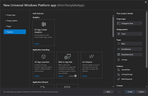
- Support adding a 3D app launcher for when the app is used in MR
- Documentation improvements (multiple issues)
- Unit Testing improvements (multiple issues)
- Platform uplift (UWP, Telerik, Windows Community Toolkit, and more)
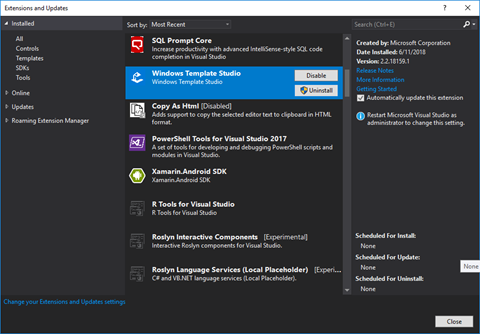
You can install the latest version of Windows Template Studio from the Visual Studio Marketplace or in Visual Studio's extension manager.
Let's walk through the new project creation process with Windows Template Studio in Visual Studio 2017. Start with File-->New Project.
Select the Windows Template Studio (Universal Windows) project type, give your project a name and click OK. Next you'll start with the project wizard.
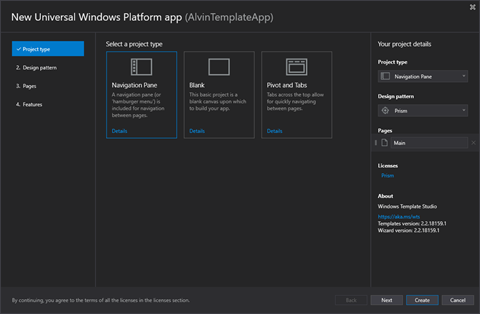
Start the wizard by choosing your project type.
- Navigation Pane
- Blank
- Pivot and Tabs
I'm going to select the Navigation Pane type, which gives you a familiar left navigation area with a hamburger menu. Select Next to move on to Design Pattern.
Choose your project's design pattern/package.
- Code Behind
- MVVM Light
- MVVM Basic
- Caliburn.Micro
- Prism
I usually choose MVVM Light for my sample applications and other simple projects. Today I am going to select Prism to see what is generated by Windows Template Studio for this pattern.
Click Next to move on to selecting what types of pages to include in your application.
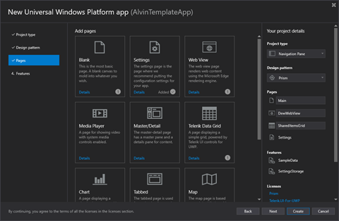
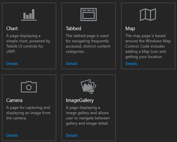
There are eleven types of pages from which to choose. Select the ones to be included in your project.
- Blank
- Settings
- Web View
- Media Player
- Master/Detail
- Telerik Data Grid
- Chart
- Tabbed
- Map
- Camera
- Image Gallery
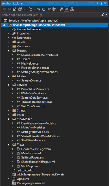
In addition to the default Main page selected, I've chosen to add a Web View named DewWebViewPage, a Settings page, and a Telerik Grid Page named SharedItemsGridPage.
Click Next again and we'll finish up by selecting some optional features to add to the app.
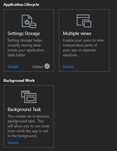
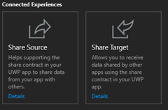
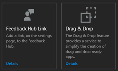
Version 2.2 now has 17 features to select for your app. Pick the ones that best suit your application's needs and feature set and click Finish to generate your project.
Now that the project has been created, you should see the default UWP welcome screen with some helpful links and your Solution Explorer. I'm going to start by taking a look at what NuGet packages were added for my project.
Based on my wizard selections, I have a handful of packages referenced by my project, including those for Prism.Unity and Telerik.UI.UWP. Your result will vary based on the pattern, pages and features selected for your project.
Next, let's expand a few of the project folders to examine the files created for the project.
You should see a View and corresponding ViewModel for each of the Pages you selected for your app, assuming you did not select the Code Behind pattern. In that case, there will be no ViewModel classes.
The Services and Helpers will also vary from those above based on your feature selections.
In my case, there is a SampleOrder in the Models folder for use with the Data Grid. This will be changed to mirror the actual model to be used in the application's grid. The SampleDataService and its corresponding interface will be used to populate the grid. The WebView also has a service and a service interface for testability.
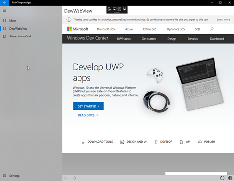
Run the app and try it out. All of the base navigation functionality is there and works great.
The Main Page
The WebView
The Data Grid
The Settings… let's change to the Dark Theme while we're in here.
That's it for the basics. Stay tuned for the next part where we will examine some of the code files and make some tweaks to make it fit your application's requirements.
Happy coding!
