Wednesday, December 27, 2017

UWP Tip #13 - 2017 Wrap-Up, Free Resources for #UWP Developers

Intro

With 2017 nearing an end, I wanted to share some of the UWP resources that I have used or evaluated this year. These are all either completely free or have a free version for personal/community use.

Resources

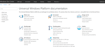
Universal Windows Platform Documentation - Get tips, tutorials for getting started, design guidance, the API reference and lots more on the Microsoft Docs Windows Dev Center.
uwp-resources1

Visual Studio Dev Essentials - A Dev Essentials subscription is free for developers' personal/community use. Get Azure credits, VS Teams Services Basic level benefits, VS Community Edition, a LinkedIn Learning 3-month subscription and a ton of other benefits. After you review all the great resources on this blog post, go here first and see what else Dev Essentials has to offer.

uwp-resources2

UWP Community Toolkit - If you follow my blog, you are well acquainted with the UWP Community Toolkit. This ever-growing collection of free, open-source controls, extensions and helpers is an essential part of every UWP developer's toolbox.

Windows Template Studio - Another essential tool from Microsoft is the Windows Template Studio. This is a Visual Studio 2017 extension that provides a wizard-style experience for bootstrapping your next UWP project. Get a head-start by selecting the pages, features, frameworks and extensions you want to use in your application.

uwp-resources3

Microsoft App Center - Build, test and distribute your Windows apps built with the Xamarin SDK.

Microsoft HockeyApp - Mobile DevOps for your apps. Get app distribution, crash reporting, metrics and track user feedback. Now free for all developers in 2018.

Microsoft Dev Center - Your hub for Microsoft Store app submissions. Submit apps to the Store, monetize your apps, create promo code, run ad campaigns to attract more users, and review your user reviews and feedback.

Progress Telerik UI for Universal Windows Platform - Offering both Open-Source and Commercial license options, Telerik's UWP control suite offers over 20 controls for app developers. Get rich controls such as Map, AutoCompleteBox, DataForm, Gauge, BulletGraph and more.

uwp-resources4

Syncfusion Essential Studio for UWP - Syncfusion also has a UWP control suite with Commercial and free Community license options. Syncfusion's Community licensing extends across all of their product offerings (over 800 components). The UWP suite includes over 60 components free for personal or community use.

uwp-resources5

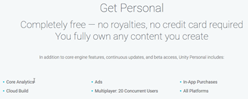
Unity Personal - Do you want to build games for the Windows platform? Get started with Unity's Personal edition which is free for beginners, students and hobbyists.
uwp-resources6

Wrap Up

Go check out some of these resources today and make the most of your time and money in 2018! Happy UWP app building!


Sunday, December 17, 2017

UWP Tip #12 - UWP Community Toolkit - Part 10, OrbitView Control

Welcome back to my UWP Community Toolkit series. The previous five tips in the series can be found here:

Intro

One of the more interesting XAML controls in the UWP Community Toolkit is the OrbitView control. The OrbitView inherits from the ItemsControl and renders its items in a layout resembling a solor system’s planets. Here is a look at the control in the UWP Community Toolkit Sample App.

Using the OrbitView Control

Since the OrbitView an ItemsCollection at its heart, any UWP developer can drop one in and get started quickly. There are several areas of focus when configuring an OrbitView.
The Control
These are some of the properties which can be set on the OrbitView to control its appearance.
  • OrbitsEnabled - Turns the visibility of the orbit lines on and off.
  • OrbitColor - Sets the color of the orbit lines.
  • OrbitThickness - Sets the thickness of the orbit lines.
  • AnchorsEnabled - Turns the visibility of the anchor lines from each item to the CenterContent on and off.
  • AnchorColor - Sets the color of the anchor lines.
  • AnchorThickness - Sets the thickness of the anchor lines.
  • IsItemClickEnabled - Controls if the items are clickable.
  • MinItemSize - The minimum size of the items in orbit.
  • MaxItemSize - The maximum size of the items in orbit.
The Items
Items can be customized by creating an ItemTemplate, DataTemplate and by setting properties on the OrbitViewDatItem itself. Create a DataTemplate for a custom look and feel of all the items. For the example in the Sample app, the DataTemplate consists of an Ellipse with a fill of a data bound image.
Here is the code for the ItemTemplate of the OrbitView in the sample app image above.

<controls:OrbitView.ItemTemplate>
    <DataTemplate>
        < controls:DropShadowPanel HorizontalContentAlignment="Stretch"
                                          VerticalContentAlignment="Stretch"
                                          BlurRadius="20"
                                          Color="Black">
            <Ellipse>
                <Ellipse.Fill>
                    <ImageBrush ImageSource="{Binding Image}" />
                </Elipse.Fill>
            </Ellipse>
        </controls:DropShadowPanel>
    </DataTemplate>
</controls:OrbitView.ItemTemplate>

Each Item can be made unique via several properties of the OrbitViewDataItem. All of these properties are available for use with data binding.
  • Image - Sets the image to be used for each specific item.
  • Distance - Indicates the distance of the item from the CenterContent.
  • Label - Sets the label on the orbit item. The DataTemplate can control the presentation of the label (caption, tooltip, etc.)
  • Diameter - Controls the relative size of the item. The diameter is a percentage based on the Min and MaxItemSize properties of the parent OrbitView control.
The CenterContent
The CenterContent contains the control to be displayed at the center of the OrbitView. Any type of control can be placed here. In the sample app, another Ellipse is that the center, but this one has a DropShadowPanel containing another Ellipse.

<controls:OrbitView.CenterContent>
    <Grid>
        <controls:DropShadowPanel>
            <Ellipse Width="105"
                  Height="105"
                  Fill="White"
                  Stroke="Black"
                  StrokeThickness="2" />
        </controls:DropShadowPanel>
        <Ellipse Width="100"
                Height="100"
                HorizontalAlignment="Center"
                VerticalAlignment="Center">
            <Ellipse.Fill>
                <ImageBrush ImageSource="ms-appx:///Assets/People/nikola.png"/>
            </Ellipse.Fill>
        </Ellipse>
    </Grid>
</controls:OrbitView.CenterContent>
The PivotItem
It is also possible to set a PivotItem to display more details about the items in the OrbitView in a new view. The Sample app shows Devices that belong to each user in orbit.

Wrap-Up

The OrbitView might not be something you use in your projects every day, but it is a really eye-popping way to represent the right data. Keep it in mind for one of your future UWP projects, and go check out the source today.

Happy coding!

Thursday, November 30, 2017

UWP Tip #11 - UWP Community Toolkit - Part 9, DockPanel Control

Welcome back to my UWP Community Toolkit series. The previous five tips in the series can be found here:

Intro

The UWP Community Toolkit v2.1.0, released November 21st, includes a new XAML control called the DockPanel.

Using the DockPanel

Like the name implies, the DockPanel control is a panel that allows children to dock to one of its sides. This docking is achieved through the DockPanel.Dock attached property. The property can be set to Top, Left, Right or Bottom. There is no Fill value to indicate filling the center of the panel.

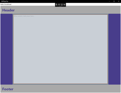
Here is the sample Window I created with a DockPanel control:

uwp_tk_dockpanel1

Each side contains a docked StackPanel. The Top and Bottom StackPanels appear first in the XAML, which is why they extend all the way to the left and right sides of the parent control instead of the left and right StackPanels extending completely to the top and bottom. I don't claim to be a UX expert, but I think the colored StackPanels help to visualize the docked areas.

To work around the lack of a Fill dock property, I tried a couple of options. When I first tried putting my TextBox as the last child of the DockPanel, it filled the middle space vertically but not horizontally. It was only about 100px wide. It could only be made wider by hard-coding the Width property. I had no luck trying different HorizontalAlignment settings on the TextBox either. I suspect there is a bug in the DockPanel causing this behavior and will be submitting an issue on GitHub.

I decided to add the TextBox as a second child in the Grid containing the DockPanel as the first child. I used the Margin property on the TextBox as a hack to make the control fit within the center of the DockPanel.

Here is the XAML source for the Window's layout:

<Grid Background="{ThemeResource ApplicationPageBackgroundThemeBrush}">
     <Grid.RowDefinitions>
         <RowDefinition Height="Auto"/>
         <RowDefinition Height="*"/>
     </Grid.RowDefinitions>
         
     <TextBlock Margin="4" Text="Hello DockPanel" VerticalAlignment="Top" HorizontalAlignment="Left"/>
         
     <Grid Padding="4,0,4,4" Grid.Row="1">
         <controls:DockPanel Background="LightSlateGray" LastChildFill="False" >
             <StackPanel Height="80" controls:DockPanel.Dock="Top" Background="DarkGray">
                 <TextBlock Text="Header" Margin="18" 
                             HorizontalAlignment="Left"  Foreground="DarkSlateBlue"
                             FontSize="36" FontWeight="Bold"/>
             </StackPanel>
             <StackPanel Height="80" controls:DockPanel.Dock="Bottom" Background="DarkGray">
                 <TextBlock Text="Footer" Margin="18" 
                             HorizontalAlignment="Left" Foreground="DarkSlateBlue"
                             FontSize="36" FontWeight="Bold"/>
             </StackPanel>
             <StackPanel Width="120" controls:DockPanel.Dock="Left" Background="DarkSlateBlue"></StackPanel>
             <StackPanel Width="120" controls:DockPanel.Dock="Right" Background="DarkSlateBlue"></StackPanel>
         </controls:DockPanel>
             
         <TextBox Margin="128,88,128,88" Opacity="0.6"
                     AcceptsReturn="True" PlaceholderText="The content. Add yours here..."/>
     </Grid>

</Grid>

Wrap-Up

It is very straightforward to use the DockPanel, outside of the quirky center area layout. Go installed the Microsoft.Toolkit.Uwp.UI.Controls NuGet package today and try it for yourself.

Happy coding!

del.icio.us Tags: ,

Monday, November 20, 2017

UWP Tip #10 - UWP Community Toolkit - Part 8, 2 Developer Tools

Welcome back to my UWP Community Toolkit series. Previous Tips in the series can be found here:

Intro

The UWP Community Toolkit contains a couple of XAML controls targeted specifically at developers and dev-focused apps. They are an AlignmentGrid and the FocusTracker. Each could be useful when developing an app UI.

AlignmentGrid XAML Control

The AlignmentGrid control can help you align other elements on a window (or within a specific container element). Let's take a look at the control running within the UWP Toolkit Sample App, outlined in Part 7 of this series.

uwp-toolkit-8.1

The control resides within the same parent Grid as the StackPanel containing the five TextBlock controls. It makes a nice way to quickly visualize your controls' layout/alignment. You can change the AlignmentGrid's Opacity and LineBrush color, depending on your preferences and your app's appearance. You can also modify the spacing of the grid lines independently with the HorizontalStep and VerticalStep properties. Here's the XAML for a simple grid containing four buttons.

<Grid Background="{ThemeResource ApplicationPageBackgroundThemeBrush}">
     <developerTools:AlignmentGrid
         x:Name="MainAlignmentGrid"
         Opacity="1"
         LineBrush="DarkGreen"
         HorizontalStep="20"
         VerticalStep="20"/>
     <StackPanel HorizontalAlignment="Center" Margin="0,40,0,0">
         <Button Content="Button 1" Margin="4"/>
         <Button Content="Button 2" Margin="4"/>
         <Button Content="Button 3" Margin="4"/>
         <Button Content="Button 4" Margin="4"/>
     </StackPanel>

</Grid>

The designer in Visual Studio 2017 shows the four buttons spaced evenly between the horizontal gridlines.

uwp-toolkit-8.2

By default the grid appears at design-time and runtime. This can be handy to check alignment at different resolutions and on different devices. When you're ready to deploy your app to the store, you can either remove the control, comment it out or add a line of code to your page's code behind to change the Visibility at runtime.

public MainPage()

{
     InitializeComponent();
     Loaded += MainPage_Loaded;

}


private void MainPage_Loaded(object sender, RoutedEventArgs e)

{
     if (!DesignMode.DesignModeEnabled)
         MainAlignmentGrid.Visibility = Visibility.Collapsed;

}

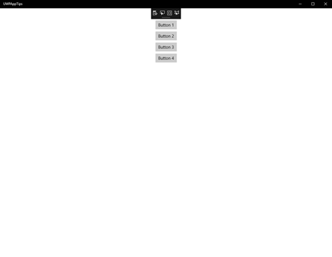
Now when we launch the app, the page appears with only the four buttons on an empty background.

uwp-toolkit-8.3


This control could also come in handy if you're developing an app that provides your users with some type of visual designer. You could additionally provide a button to toggle the visibility of the grid on/off.

FocusTracker

The FocusTracker appears as a read-only property panel displaying four properties of the currently selected XAML control on your page. The four properties displayed are:
  • Name - The name of the current XAML control, if it has one.
  • Type - The type of the current XAML control.
  • Automation.Name - If you're using UI automation and have provided the current control for this, it is displayed here (set via AutomationProperties.Name attached property).
  • Parent with Name - Traversing up the visual tree, the first parent found to have a name is displayed here, if any.
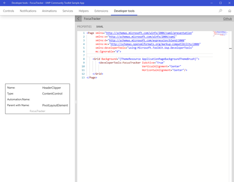
Here is the FocusTracker control running within the Sample App:

uwp-toolkit-8.4

I had clicked on the header of the code panel on the right side before taking the screen shot. Here's another shot after clicking within the code panel itself:

uwp-toolkit-8.5

You can see the FocusTracker immediately updated to display the info for the WebView hosting the XAML editor. Pretty cool!

I could see this being particularly useful to drop onto a page when you're trying to track down some issues with your automated UI tests. Give it a try if you deal with a lot of complex UI under test.

Wrap-Up

Both of these controls are definitely niche tools for a specific set of use cases, but they could both save you a ton of time if your app falls into one of those categories. Both are available in the Microsoft.Toolkit.Uwp.DeveloperTools NuGet package. Go give them a try!

Happy coding!

Tuesday, November 7, 2017

UWP Tip #9 - UWP Community Toolkit - Part 7, the Sample App

Welcome back to the UWP Community Toolkit series. Previous Tips in the UWP Community Toolkit series:
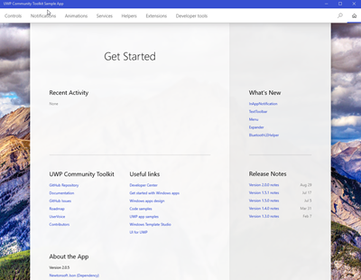
Did you know that there is a UWP Community Toolkit Sample App in the Microsoft Store?
uwptoolkitapp
The main page of the app is a dashboard with several sections:
  • Recent Activity - Shows your recent activity within the sample app.
  • What's New - Highlights new and updated features of the UWP Community Toolkit.
  • UWP Community Toolkit - General official links to aspects of the toolkit, including the GitHub repo, issues, roadmap and UserVoice.
  • Useful Links - These are links relevant to Windows app developers which aren't necessarily directly related to the toolkit. Things like the Windows Developer Center can be found here.
  • Release Notes - Release notes for recent UWP Community Toolkit releases are linked here.
  • About the App - Info and links that you would typically find on your app's About page are here on the dashboard.
Across the top, you'll find a menu bar with the categories of resources available in the Toolkit.
  • Controls
  • Notifications
  • Animations
  • Services
  • Helpers
  • Extensions
  • Developer tools
We've already covered many of these categories in this series. Clicking on controls expands a submenu with the different control types currently available in the toolkit, and hovering over one of them displays a preview of the control and its description.
uwptoolkit-controls
Let's select the HamburgerMenu and see what we can do with it in the sample app.
uwptoolkit-hamburger
Here you'll find a live preview of the control on the left side and a pane on the right with a link to the source on GitHub and three selectable panes.
  • Properties - Exposes some of the control's properties for manipulation. Make changes here and they're immediately reflected on the live preview.
  • Xaml - Displays the current Xaml source code of the page hosting the control in the live preview. Any updates you make to the Xaml source are immediately reflected in the live preview.
  • Documentation - Displays the documentation for the selected control from docs.microsoft.com.
The live preview is functional and interactive. You can interact with the menu to navigate through it's sections, displaying different images in the main panel.
The sections not related to controls, display a preview of the code output for different helper types. You can use the right panel to view both source code and docs. Take a look at the Network helper.
uwptoolkit-network
The sample app is a great way to get started exploring the UWP Community Toolkit. If you have been following along with my toolkit series and are ready to start using it yourself, I strongly encourage you to download the sample app. It will be a handy guide as you get started on your own apps leveraging the toolkit.

Happy coding!